Advertising / A1 / BROADCAST
Good Things Happen (Series)
| Submitted By: | | LMNO |
|---|---|
| Job Title: | Personal Health Plans |
| Client: | Saskatchewan Blue Cross |
| Client Business: | Health Insurance |
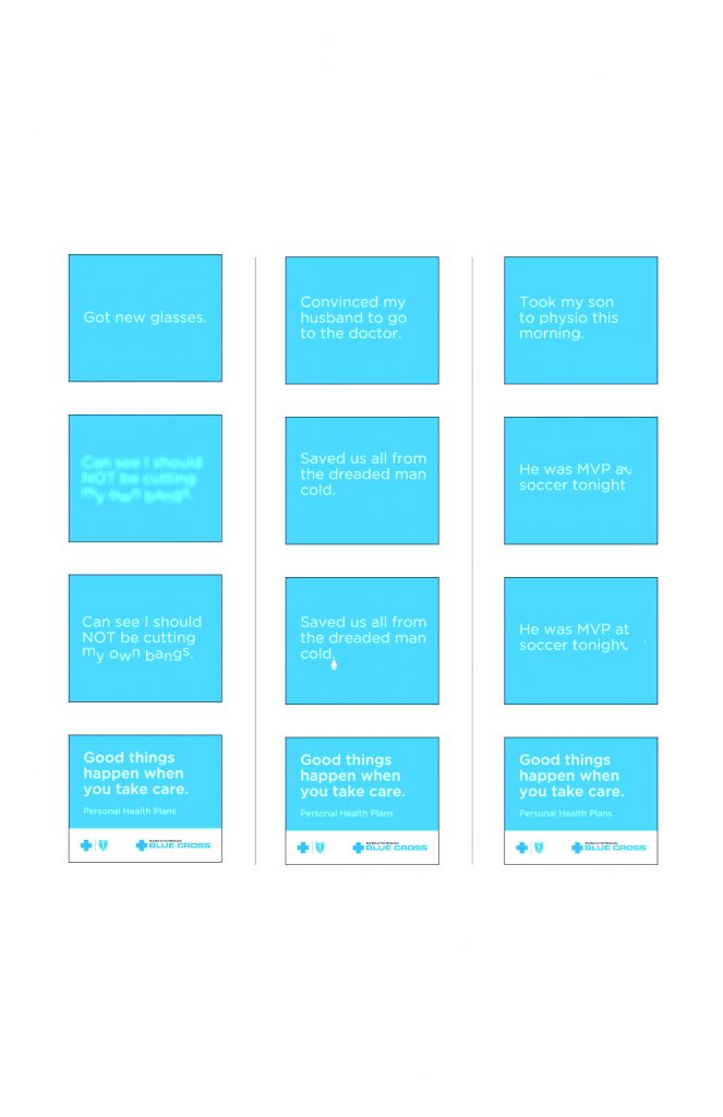
Raise awareness of the personal health plans by informing people that you don’t have to wait for something bad to happen in order to take advantage of your health insurance. Good things happen when you take care every day.
CCL PSA Tv Series
| Submitted By: | Wes Fyck | National Brand Communications |
|---|---|
| Job Title: | CCL PSA Tv Series |
| Client: | Citizens Climate Lobby |
| Client Business: | Environmental activists |
CCL is a grass roots, non-partisan, non-profit organization run by volunteers, that began in the US in 2007, and in Canada in 2011. There are now 200 chapters in the US, 30 in Canada and growing rapidly. CCL takes the view that politicians generally do not create political will; instead they respond to it. Therefore, a PSA ad campaign would be well timed to air asap in Canada, to give political candidates pre-election time to craft their platforms to address climate change meaningfully, while simultaneously raising awareness with voters to vote for politicians who will step up on this issue. Another side objective could be to increase memberships in CCL. This series was created to draw awareness to the challenges our environment is facing and to let citizens know there is a workable solution.
These aired on national TV across Canada in 2015, and the U.S. during the 2016 presidential election. (U.S. versions were made.) They even aired during the last game of the 2015 World Series.
Advertising / A2 / CAMPAIGN
Frugal & Smart
| Submitted By: | | LMNO |
|---|---|
| Job Title: | Peak Campaign |
| Client: | Saskatchewan Pension Plan |
| Client Business: | Pension Plan |
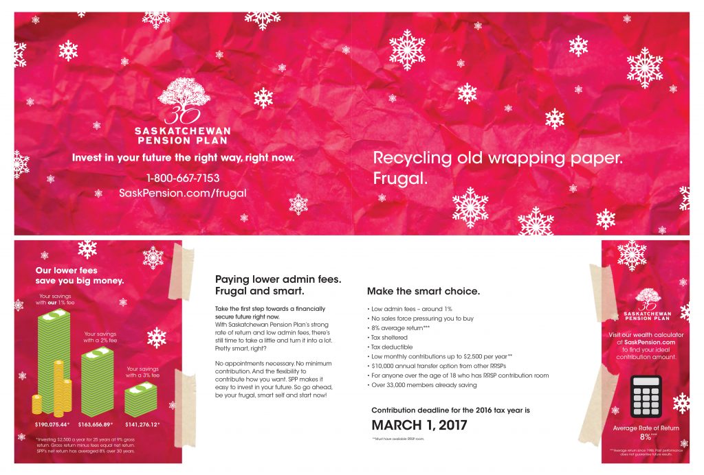
Being cheap isn’t always a bad thing. In this campaign, we proved that you can be frugal AND smart while planning for your retirement.
Consider a Co-op Campaign
| Submitted By: | David Melashenko | David Melashenko Design + Advertising |
|---|---|
| Job Title: | Consider a Co-op Campaign |
| Client: | Co-operatives First |
| Client Business: | Business support organization |
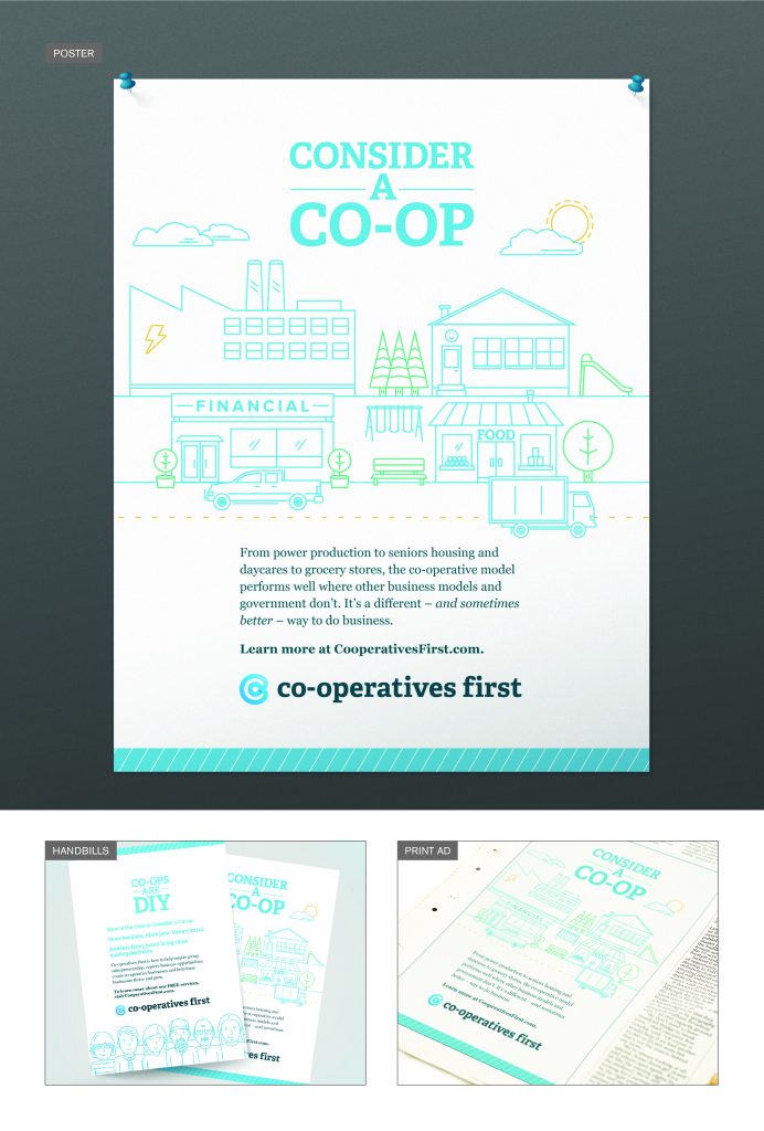
Co-operatives First helps potential entrepreneurs determine if the co-operative business model is a good fit for their business idea, and offers support throughout the process. Their major focus is rural – and often remote – communites in western Canada.
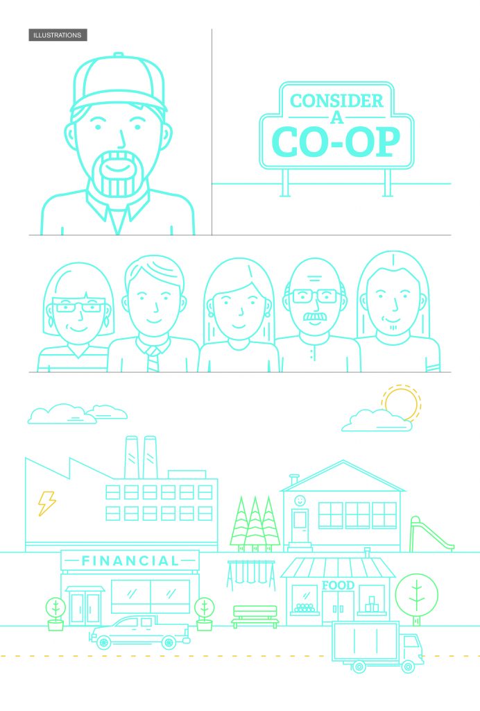
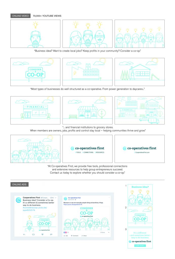
This low-budget awareness campaign helped get the word out, by asking the viewer to at least consider the idea of a co-op. Simple, fun, illustrations of people and businesses were combined to represent a thriving community. The illustrations are versatile enough to be used individually, or together, in all types of promotional materials. The look and feel of the campaign stood apart from typical business-focused advertising.
A mix of traditional and digital media was used, with the video being a major element. Engagement was very high for all digital components, with YouTube views approaching 75,000.
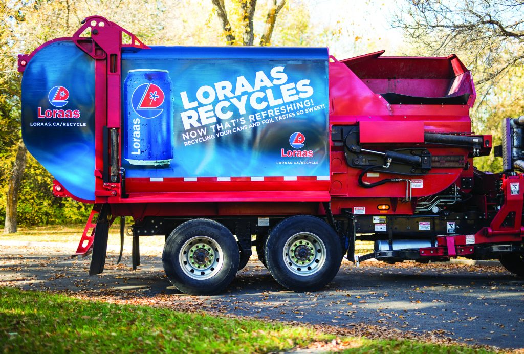
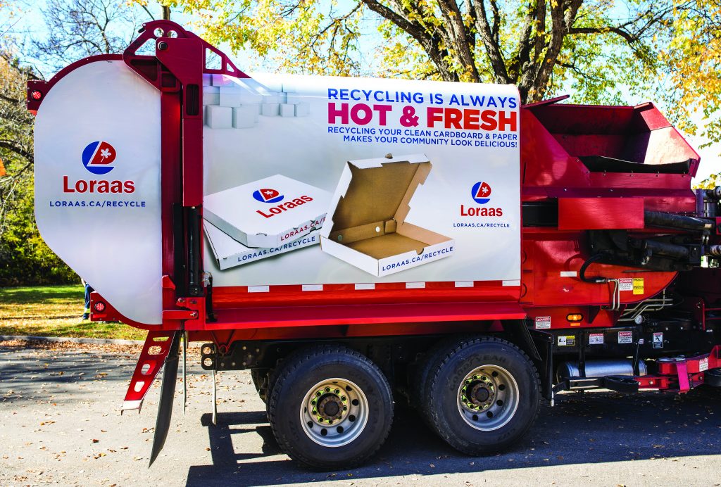
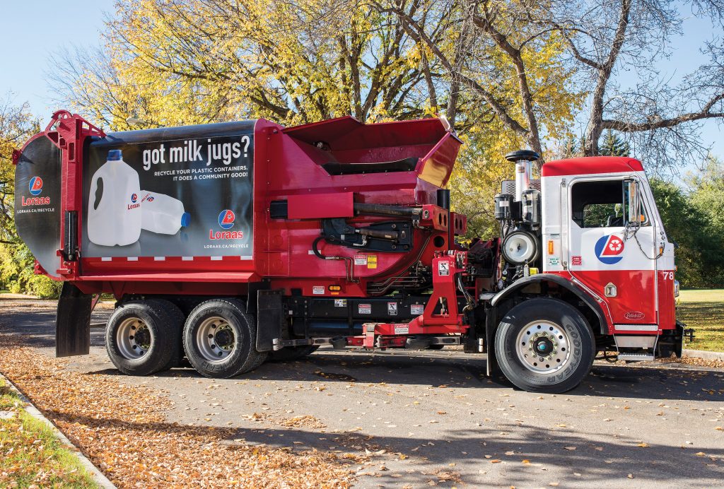
Loraas Disposal Truck Wrap Campaign
| Submitted By: | Ryan Townend | William Joseph Communications |
|---|---|
| Job Title: | Associate Creative Director |
| Client: | Loraas Disposal |
| Client Business: |
Advertising / A3 / PRINT ADVERTISEMENT
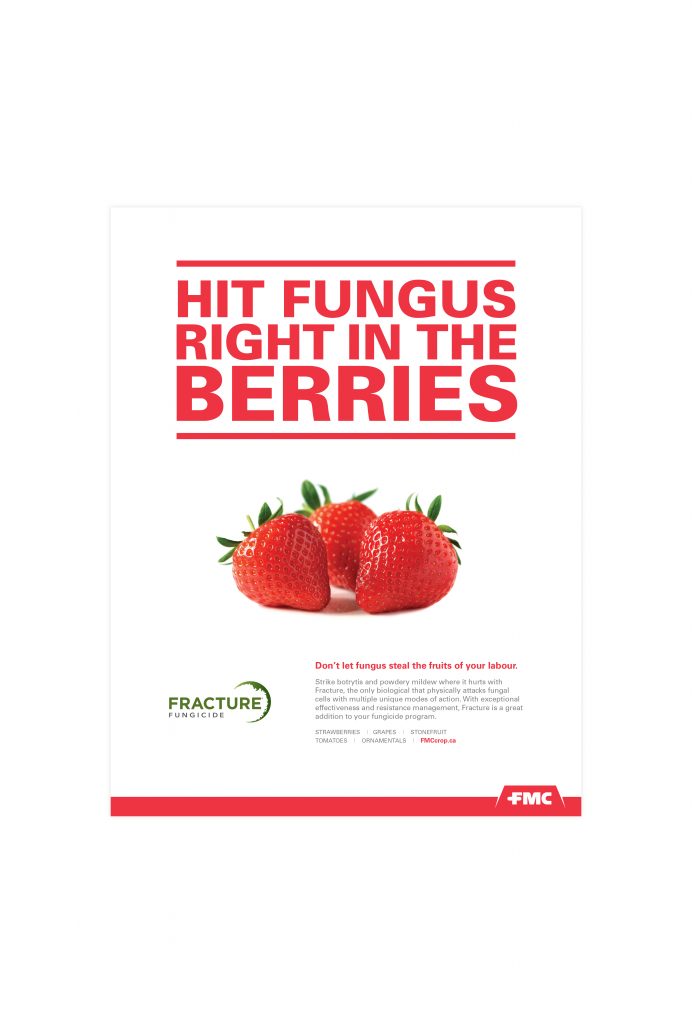
Hit Fungus Right in the Berries
| Submitted By: | Dean Owen | MGM Communications |
|---|---|
| Job Title: | Fracture Print Ad |
| Client: | FMC |
| Client Business: | Agriculture |
Advertising / A4 / OUTDOOR
Kavia Reflective billboard
| Submitted By: | colin mcfadyen | National Brand Communications |
|---|---|
| Job Title: | Kavia Outdoor |
| Client: | Kavia Auto Body |
| Client Business: | Auto body repair |
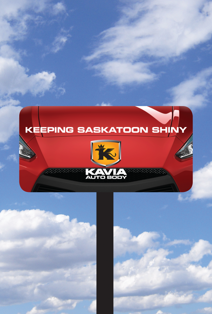
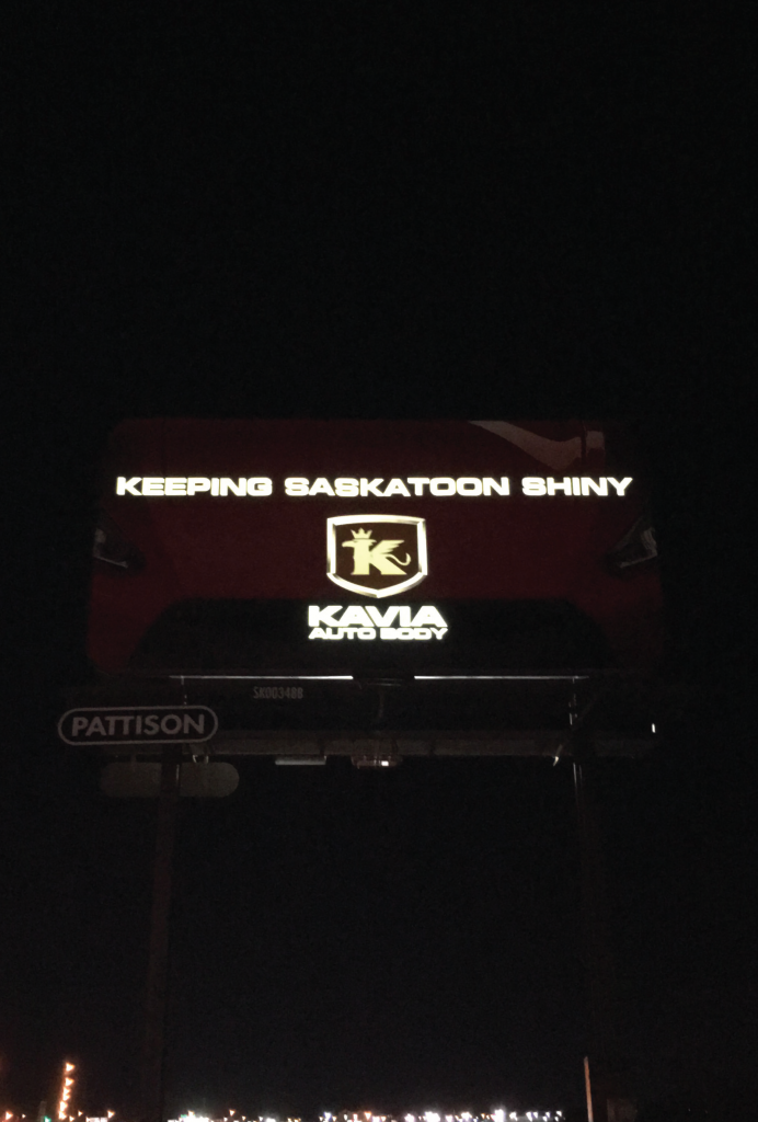
To launch the years new creative we wanted to do something special. The new messaging was “Keeping Saskatoon Shiny” and we had a special way to show this, we created a ‘reflective billboard’. During the day the billboard looked as it should, but at night we had the lights turned out and it was completely black. By printing the type and logo out in reflective materials when a car drove by it illuminated the type and logo revealing our new slogan.
Can You Dig It?
| Submitted By: | Dean Owen | MGM Communications |
|---|---|
| Job Title: | Click Before You Dig - Outdoor |
| Client: | SaskEnergy |
| Client Business: | Natural Gas |
Advertising / A5 / WEB ADVERTISEMENT
Good Things Happen (Series)
| Submitted By: | | LMNO |
|---|---|
| Job Title: | Personal Health Plans |
| Client: | Saskatchewan Blue Cross |
| Client Business: | Health Insurance |
You don’t have to wait until something bad happens to take advantage of your health insurance. Good things happen when you take care every day.
Always Believe Something Wonderful is About to Happen
| Submitted By: | Jennifer Bews | The Authentic Voice |
|---|---|
| Job Title: | Graphic & Event Designer |
| Client: | Enlightened Dance Corp |
| Client Business: | Dance Studio |
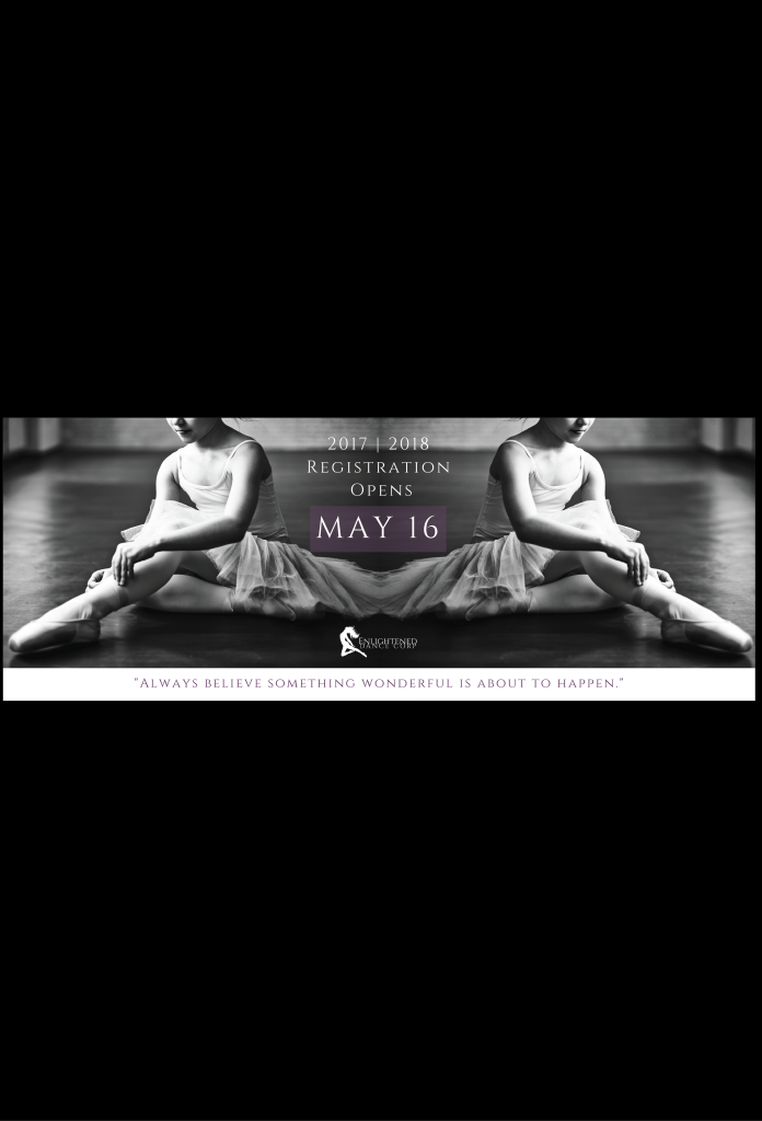
Create a Facebook event cover photo for promoting the Registration Night at Enlightened Dance Corp.
Advertising / A6 / WEB VIDEO
Handshake/Pizza (Series)
| Submitted By: | | LMNO |
|---|---|
| Job Title: | Business Campaign |
| Client: | Saskatchewan Pension Plan |
| Client Business: | Pension Plan |
Engage and inform small business owners that a Saskatchewan Pension Plan is an easy, affordable and no-obligation way to reward and retain employees.
Smokers’ Helpline
| Submitted By: | Bravo Tango Advertising | Bravo Tango Advertising |
|---|---|
| Job Title: | Designer/Art Director |
| Client: | Saskatchewan Cancer Society |
| Client Business: |
The Saskatchewan Cancer Society engaged Bravo Tango to create a video targeting First Nations smokers in northern communities. The goal of the video was to promote the Smokers’ Helpline, a FREE service available 24/7 for smokers wishing to quit. For the first time, the helpline was available in English, Dene, and Cree. Bravo Tango created an engaging video that communicated both the cultural significance of tobacco, as well as the associated health risks and social stigmas of smoking. The video incorporated original First Nations inspired illustrations, as well as a voice over by a First Nations narrator. The video was successfully translated into Dene and Cree and shared through various channels.
Make Your Move
| Submitted By: | Dean Owen | MGM Communications |
|---|---|
| Job Title: | Mortgage Campaign Online Video |
| Client: | Affinity Credit Union |
| Client Business: | Finance |
Studio FIAT Saskatoon Video
| Submitted By: | Dustin Ratzlaff | unINK Marketing & Creative Agency |
|---|---|
| Job Title: | CEO |
| Client: | Studio FIAT Saskatoon |
| Client Business: | Automotive Sales |
This project was crafted to create brand awareness for Studio FIAT Saskatoon with the younger generation while highlighting the variety of colour options for consumers in personalising their own car.
Advertising / A8 / NON-TRADITIONAL
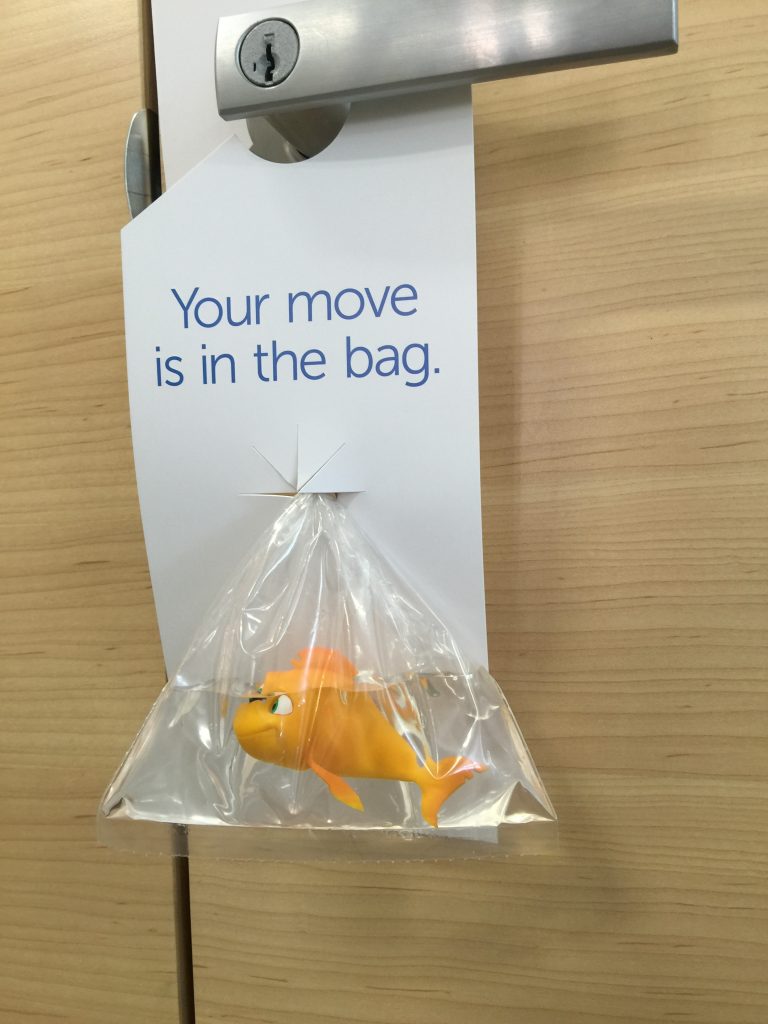
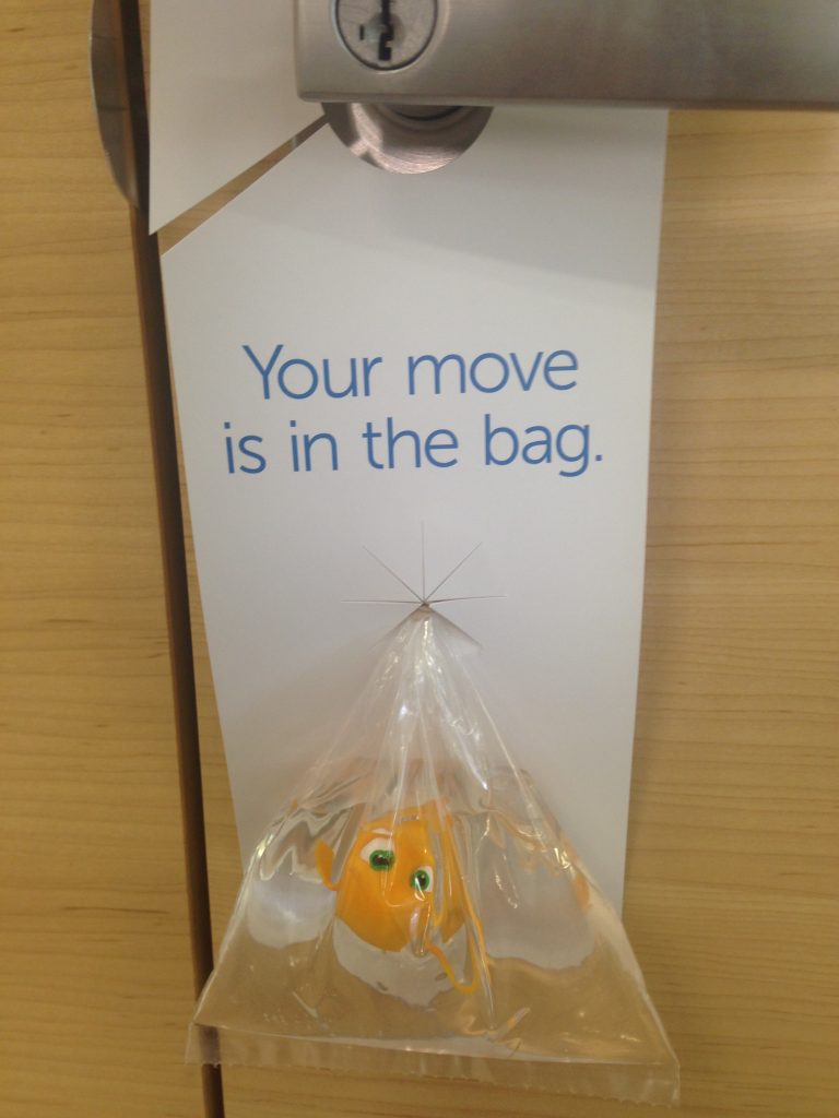
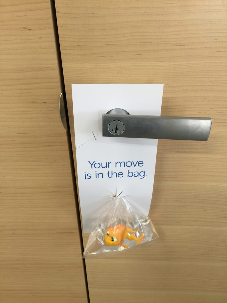
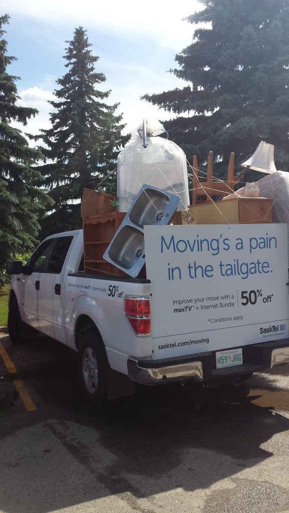
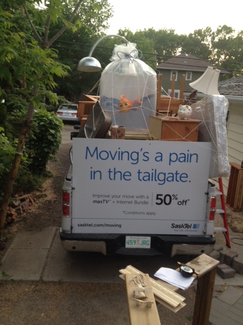
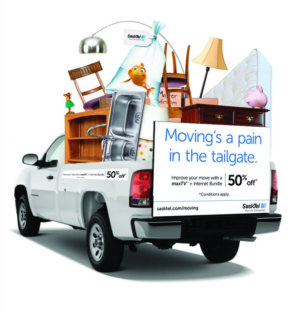
Your Move is in the Bag
| Submitted By: | | LMNO |
|---|---|
| Job Title: | Moving Campaign |
| Client: | SaskTel |
| Client Business: | Telecommunications |
Demonstrate that SaskTel makes your move easier with 50% off bundled TV and internet.
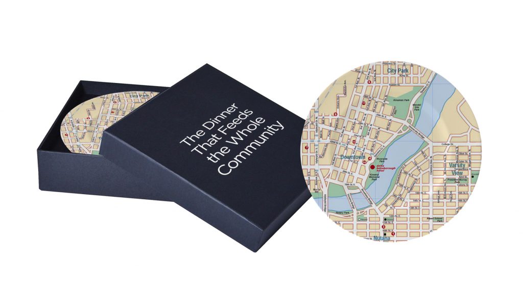
Kinsmen Plate
Craft / C1 / WRITING
U of R – Find Balance – 60 sec.
| Submitted By: | Bravo Tango Advertising | Bravo Tango Advertising |
|---|---|
| Job Title: | Writer |
| Client: | University of Regina |
| Client Business: | Education |
The University of Regina engaged Bravo Tango to help create a promotional video as part of their 2016/17 student recruitment campaign. The result was a 60 second video that included original footage of real university of Regina students engaged in a variety of authentic university experiences. The goal of the video was the accurately depict the concept of finding balance while pursuing a post-secondary education. The goal of the script was to highlight the holistic nature of a university experience. Balance between academics and non-academics is vital to any successful university experience. The script and visuals worked together to communicate how balance is vital in university and in life, in general.
Golf’s Steakhouse Campaign
| Submitted By: | Bravo Tango Advertising | Bravo Tango Advertising |
|---|---|
| Job Title: | Copywriter |
| Client: | Golf's Steakhouse - Regina |
| Client Business: | Food & Drink - Restaurant |
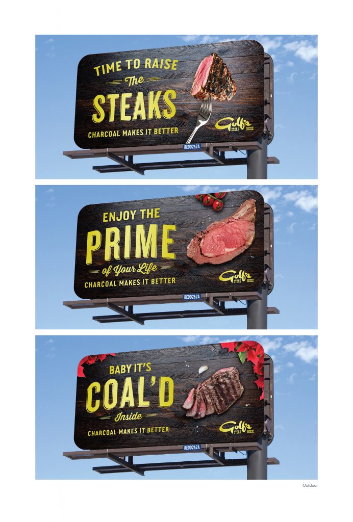
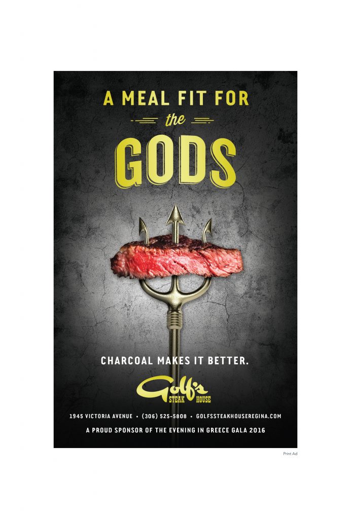
Golf’s Steak House has a distinct advantage within the local market – it is the ONLY steak house in Regina to use a charcoal grill. This brand advantage was discovered after a competitor analysis and became the inspiration for the development of the company tagline “CHARCOAL MAKES IT BETTER”. Through a series of cheeky and fun outdoor headlines, we have been able to communicate this distinct advantage in a clear and memorable way.
Craft / C2 / ILLUSTRATION
Westerra Campaign
| Submitted By: | Bravo Tango Advertising | Bravo Tango Advertising |
|---|---|
| Job Title: | Designer/Art Director |
| Client: | Westerra Regina |
| Client Business: | Residential and Retail Land Development |
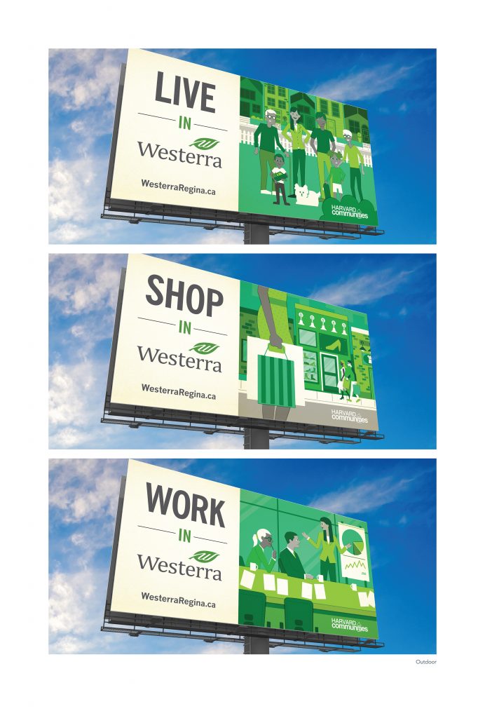
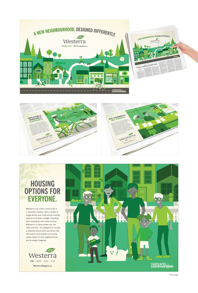
In a city where new neighbourhoods seemed to be popping up monthly, it was important to the developers that this complete community would stand out from the rest. After leading an in-depth brand discovery session with our clients, we were able to develop a one-of-a-kind identity, including the Westerra name, logo, tagline, visual ID, and language. The tagline “A New Neighbourhood, Designed Differently” successfully communicated that this community would be completely unique. All visuals, including original illustrations, were designed to highlight and emphasize the fact that Westerra is unlike any other community in Regina. Creative executions supported this idea by highlighting various features that would be available within the community, including a wide variety of housing styles, ample green spaces, retail and boutique shopping, as well as a business park. The launch campaign included a wide media mix, including outdoor, online, television, transit, print, and social media posts.
Victor
| Submitted By: | Hal Schrenk | Hal Schrenk Graphic Design |
|---|---|
| Job Title: | SSO Poster Illustration |
| Client: | Saskatoon Symphony Orchestra |
| Client Business: | Music |
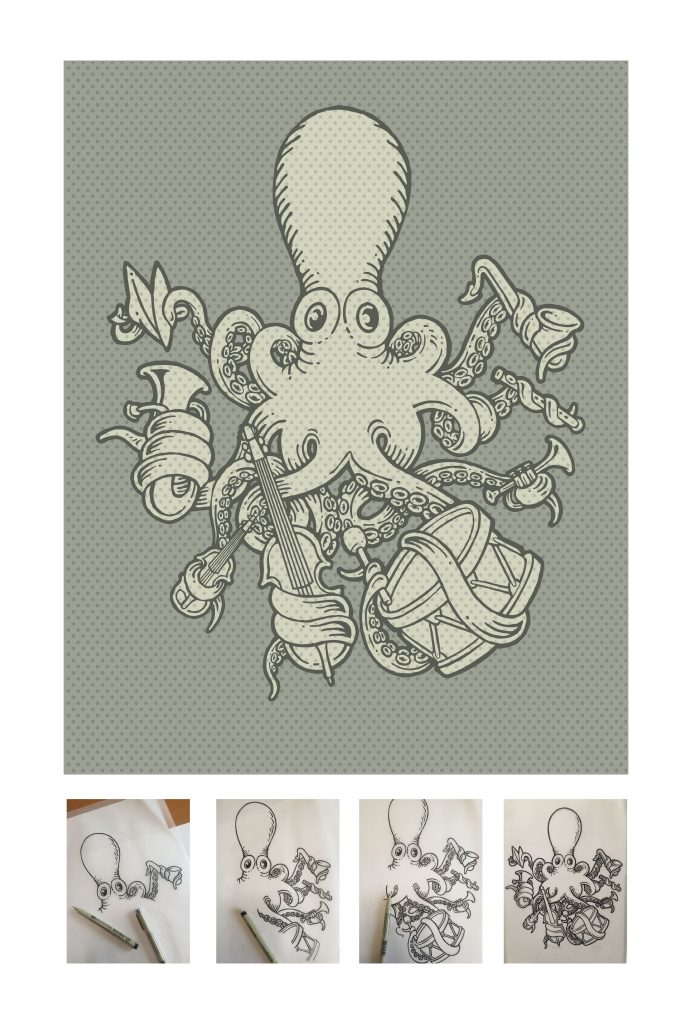
A poster was to be created for a concert performed by the Saskatoon Youth Symphony Orchestra. The style was to be inspired by Theodor Seuss Geise and pay homage to Maestro Victor Sawa. Collector silkscreened prints and T-shirts were also offered.
Craft / C3 / PHOTOGRAPHY
Dirt Junkie
| Submitted By: | Hal Schrenk | Hal Schrenk Graphic Design |
|---|---|
| Job Title: | Bruin |
| Client: | Bruin |
| Client Business: | Music |
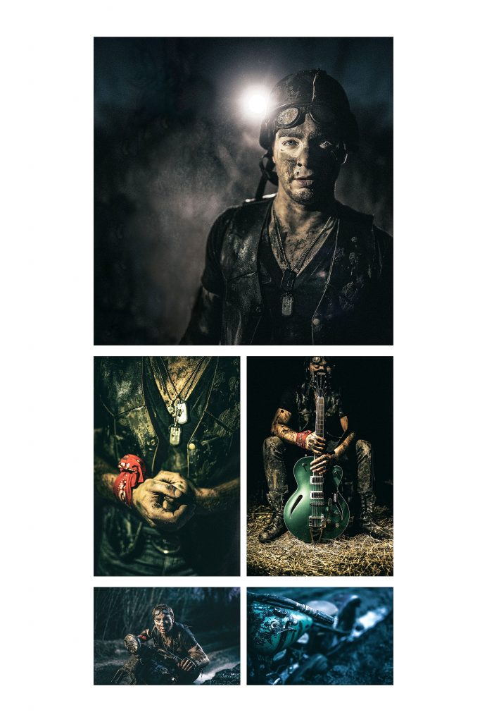
Create imagery for the debut recording from Bruin Eberle. Since the title was “Dirt Junkie” we recreated a motorcycle mudd bath scene. All mud was applied with mud makeup, we used a motorcycle that didn’t work, so we brought a smoke machine and we ran out of light, so the cover and hands shot was done with the assistance of four hand held iphones.
Art of Vintage Rentals Photo Shoot
| Submitted By: | Jennifer Bews | The Authentic Voice |
|---|---|
| Job Title: | Art of Vintage Rentals Photo Shoot |
| Client: | Art of Vintage |
| Client Business: | Vintage Retail |
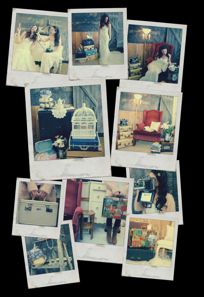
Design a visual online photo series that can be used to promote the product to help generate awareness and sales for the rental division of the business through the website, email newsletters, Instagram, Twitter and Facebook.
Craft / C4 / TYPOGRAPHY
2015 Edwards School of Business Holiday Greeting Card
| Submitted By: | Larry Kwok | Edwards School of Business, University of Saskatchewan |
|---|---|
| Job Title: | Marketing Coordinator |
| Client: | Edwards School of Business |
| Client Business: | Post-Secondary Business Education |
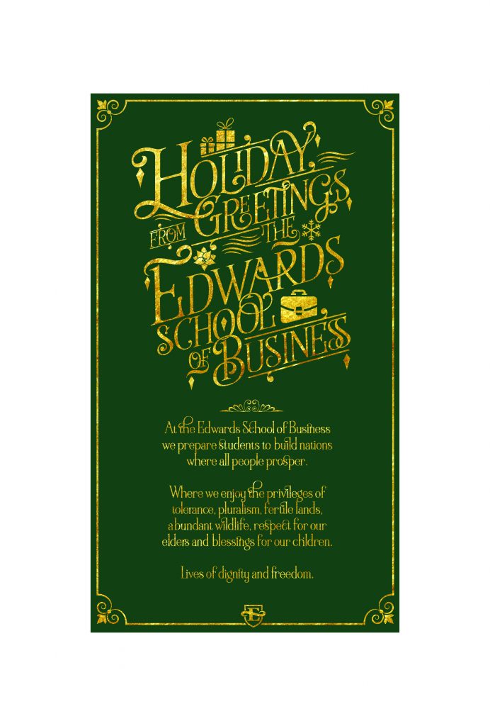
The Annual Edwards School of Business Holiday card needed to be a special piece that celebrated the holidays from the business college. The Dean required a design that expressed holidays, but also reminded recipients that this was coming from the business school. The card was sent out to all students, faculty, donors, staff, alumni and friends. The use of green was something that traditionally emphasized the holidays, but is also the colour of the Edwards School. Gold foil for the lettering symbolized the holidays and gave a sense of wrapping paper and ribbons. The letterform was also sprinkled with images of snowflakes, decorations and gifts, but also subtlety a briefcase icon to establish both feelings of holiday cheer and business.
Design / D01 / ANNUAL REPORT
YQR – Annual Report
| Submitted By: | Bravo Tango Advertising | Bravo Tango Advertising |
|---|---|
| Job Title: | Designer/Art Director |
| Client: | Regina Airport Authority |
| Client Business: | Travel |
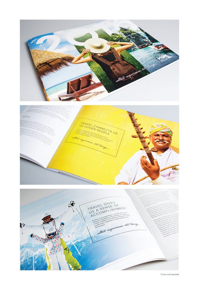
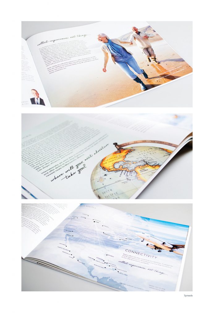
The Regina Airport Authority (RAA) approached Bravo Tango looking for a completely refreshed design of their annual report. The new approach implemented a creative strategy that focused on the meaning of travel, the memories it creates, and the emotional experience it invokes. In other words, the RAA is more than a physical location for the transaction of travellers. It goes much deeper, where the RAA provides a gateway to life experiences abroad, and which ultimately develop into lifelong and cherished memories.
With this as our driving force, the main creative theme at the core of our design was the genuine ‘happiness’ that is derived from ‘travel’. Happiness isn’t about collecting things, but rather about collecting experiences – and the YQR airport is the gateway to that happiness. Our tactics included using specific imagery and applying a modern yet minimalistic aesthetic design.
Last and certainly not least, we also designed, coded and launched a digital version of the annual report to compliment the printed version. This digital version was a shortened, executive summary highlighting some of the unique and proud facts of the airport, and it was animated in HTML5 to add a dynamic sense of movement. https://www.yqr.ca/annual-report/2016/
College Program Guide
| Submitted By: | Dustin Ratzlaff | unINK Marketing & Creative Agency |
|---|---|
| Job Title: | CEO |
| Client: | Great Plains College |
| Client Business: | College |
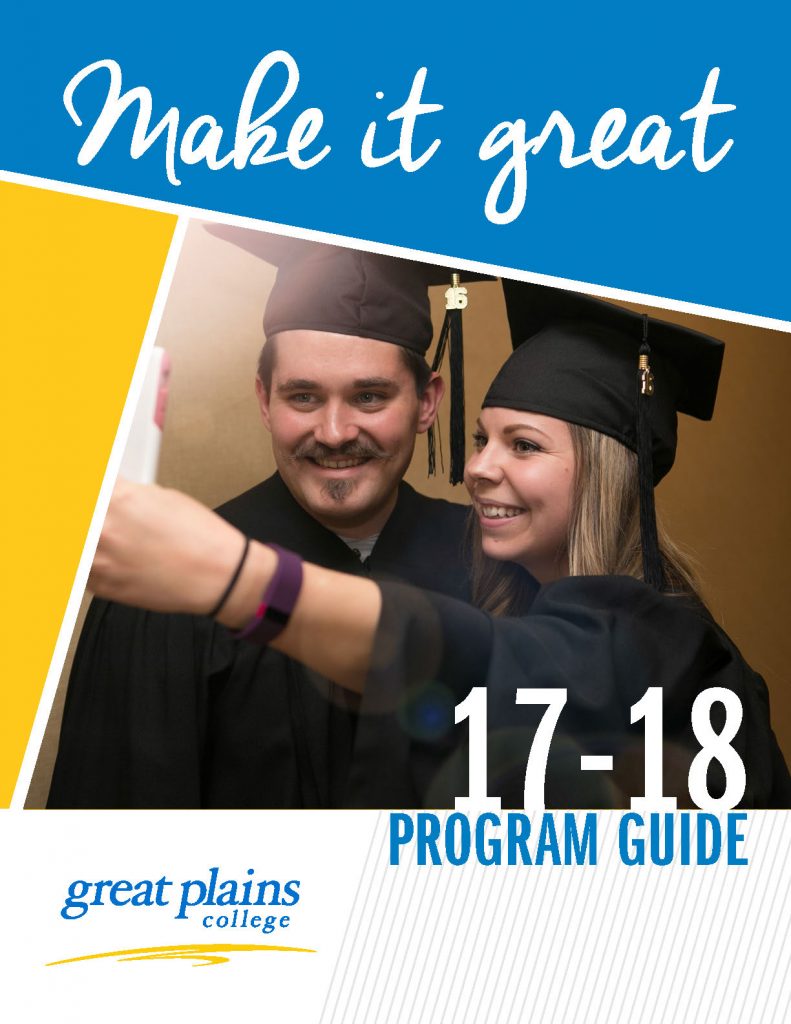
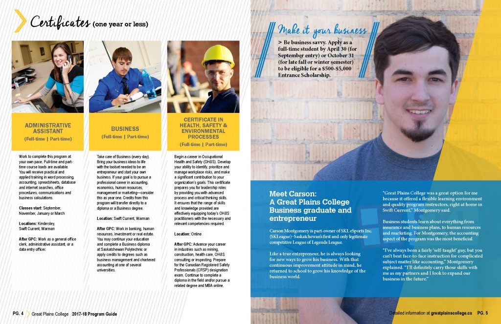
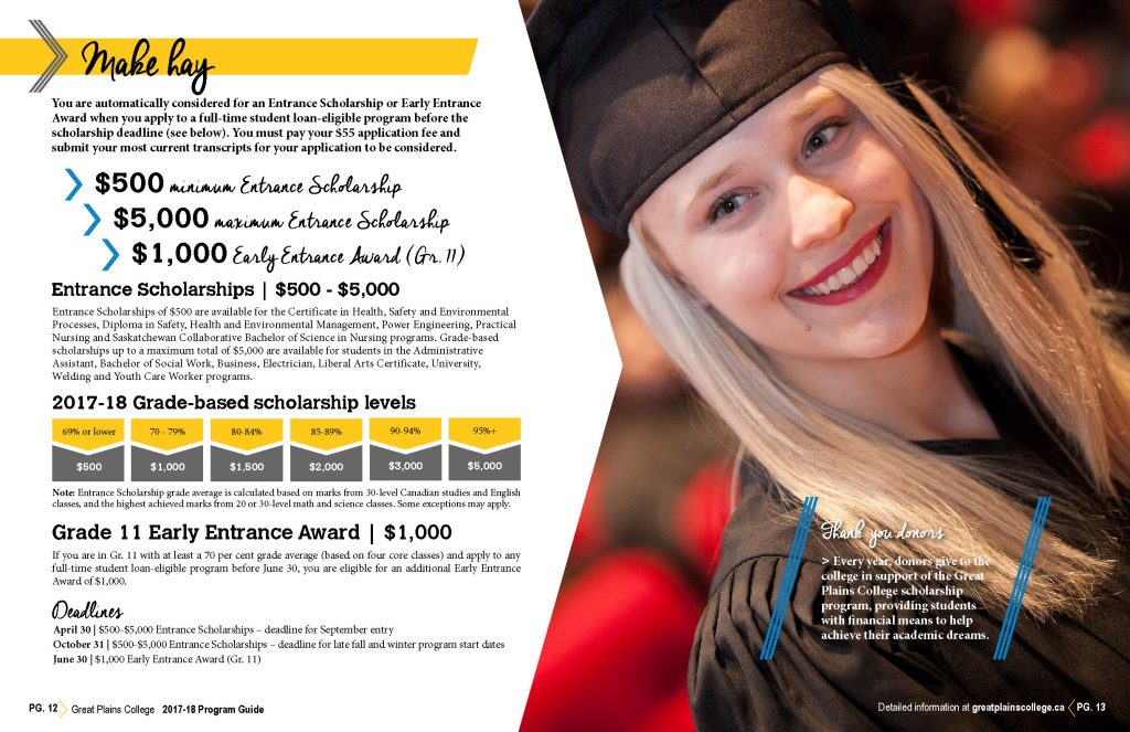
This program guide was made to highlight the available courses and benefits the college has to offer in a way that is easily digestible and engaging. The angular and bright design style of the program was targeted towards young adults considering an alternative to the typical educational system.
Better Than Ever – SPL’s Report to Our Community
| Submitted By: | Ryan Schmidt | Saskatoon Public Library |
|---|---|
| Job Title: | Graphic Designer |
| Client: | Saskatoon Public Library (SPL) |
| Client Business: | Library |
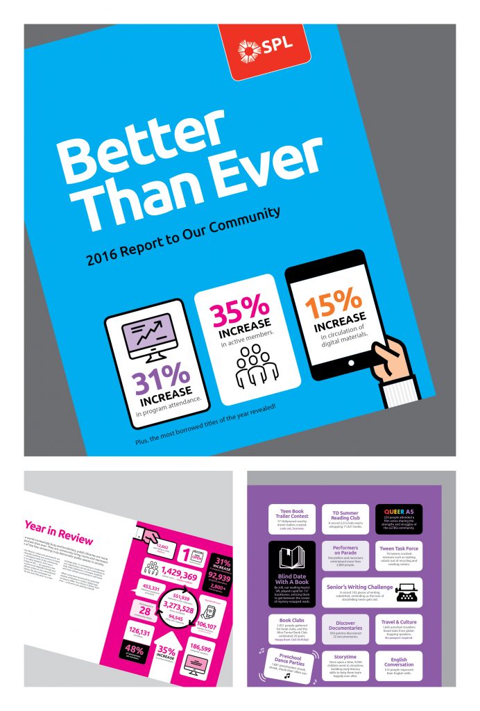
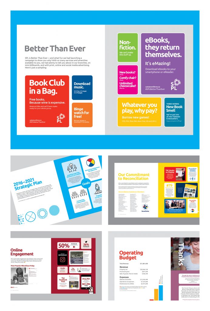
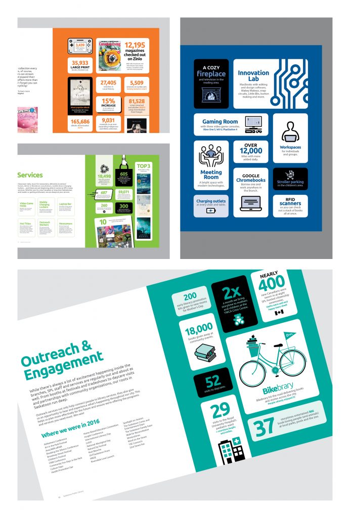
SPL’s 2016 Report to Our Community was intended to provide an overview of the stats, facts, programs, services and partnerships that summed up the year that was.
Many of SPL’s most important metrics trended significantly upward in 2016. Therefore, the Report leaned heavily on infographics to tell these stories in accessible ways. The writing was also intentionally fun, snappy and creative, as we are looking to position SPL as a modern, engaging and innovative public institution.
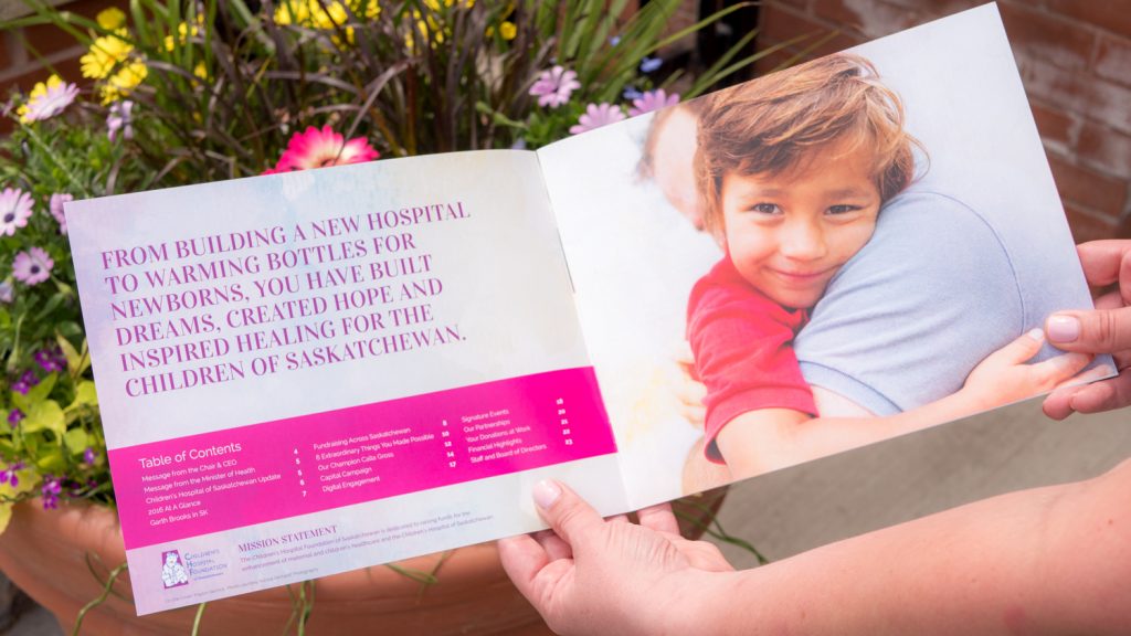
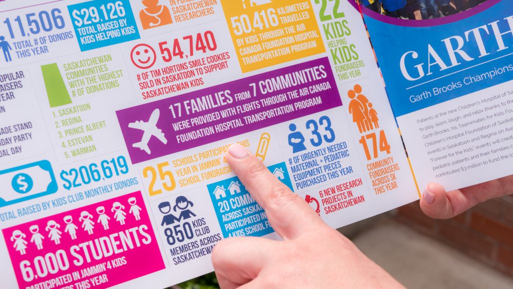
Children’s Hospital Foundation of Saskatchewan 2016 Annual Report
| Submitted By: | Ryan Townend | William Joseph Communications |
|---|---|
| Job Title: | Art Director |
| Client: | Children's Hospital Foundation of Saskatchewan |
| Client Business: | Non-profit |
Design / D02 / BROCHURE / CATALOGUE / BOOK / BOOKLET
U of R Viewbook
| Submitted By: | Bravo Tango Adverising | Bravo Tango Adverising |
|---|---|
| Job Title: | Designer/Art Director |
| Client: | University of Regina |
| Client Business: | Education |
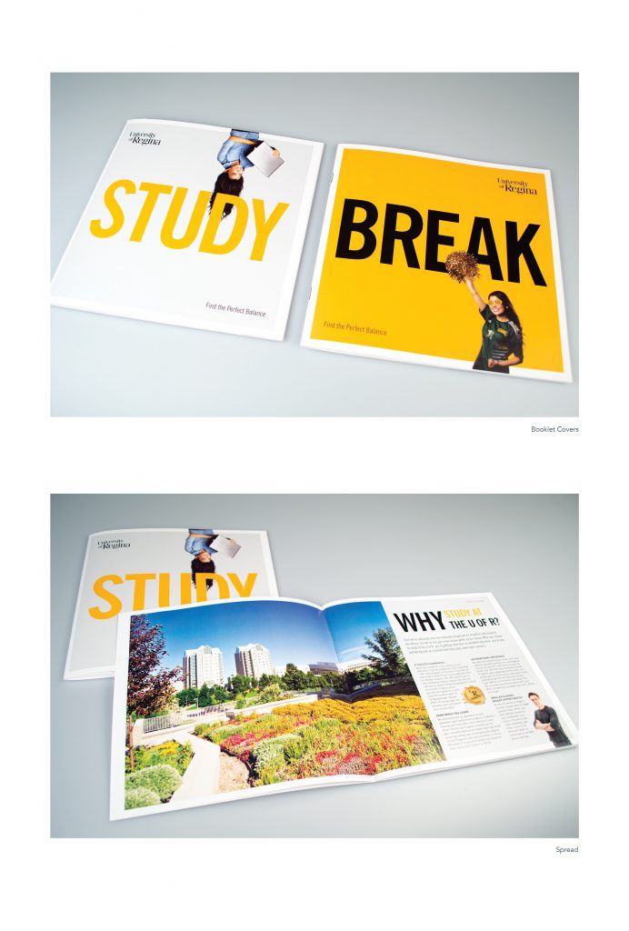
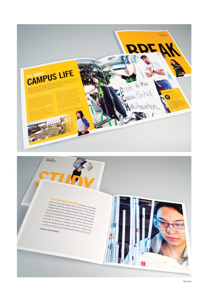
The annual viewbook is the single most important recruitment tool used by the University of Regina to attract new students. The piece is used by high school career counselors and at a variety of recruitment events and tradeshows. The purpose of the book is to communicate the strengths of the university and provide detail on a wide range of university features, including programming, student housing, facilities, athletics programs, and more. Through a mix of vibrant campus photography and engaging copy, we were able to produce a book that successfully communicated the advantages of attending the UofR. Our innovative concept highlighted both sides of the university experience, with one side of the book concentrating on academics (STUDY), while the reverse side of the book (BREAK) explored extra-curricular activities available on campus. The concept was supported by the viewbook tagline “Find the Perfect Balance”.
UR International – Study Abroad – Booklet
| Submitted By: | Bravo Tango Advertising | Bravo Tango Advertising |
|---|---|
| Job Title: | Designer/Art Director |
| Client: | UR International |
| Client Business: | Education |
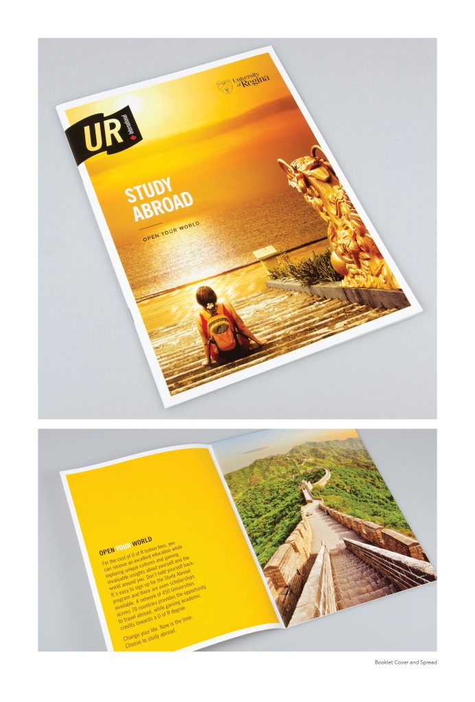
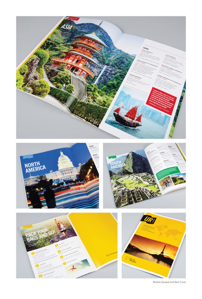
Through the UR International Study Abroad Program students are provided with an opportunity to travel abroad and gather cultural experiences while working toward a degree. Bravo Tango was engaged to design the Study Abroad Viewbook for UR International. The purpose of this promotional piece is to provide students with information about the program and entice them to consider taking part. While the goal of the piece is to communicate details of the program, we also worked hard to portray the overall experience as fun, exciting, and enlightening. Through use of large and stunning imagery, we were able to highlight many of the great places students can visit and mind-opening experiences that can be had through the program.
NexusAg Product Book
| Submitted By: | Cheryl McDougall | OneOliveDesign |
|---|---|
| Job Title: | NexusAg Product Book |
| Client: | NexusAg |
| Client Business: | Fertilizer Distributor |
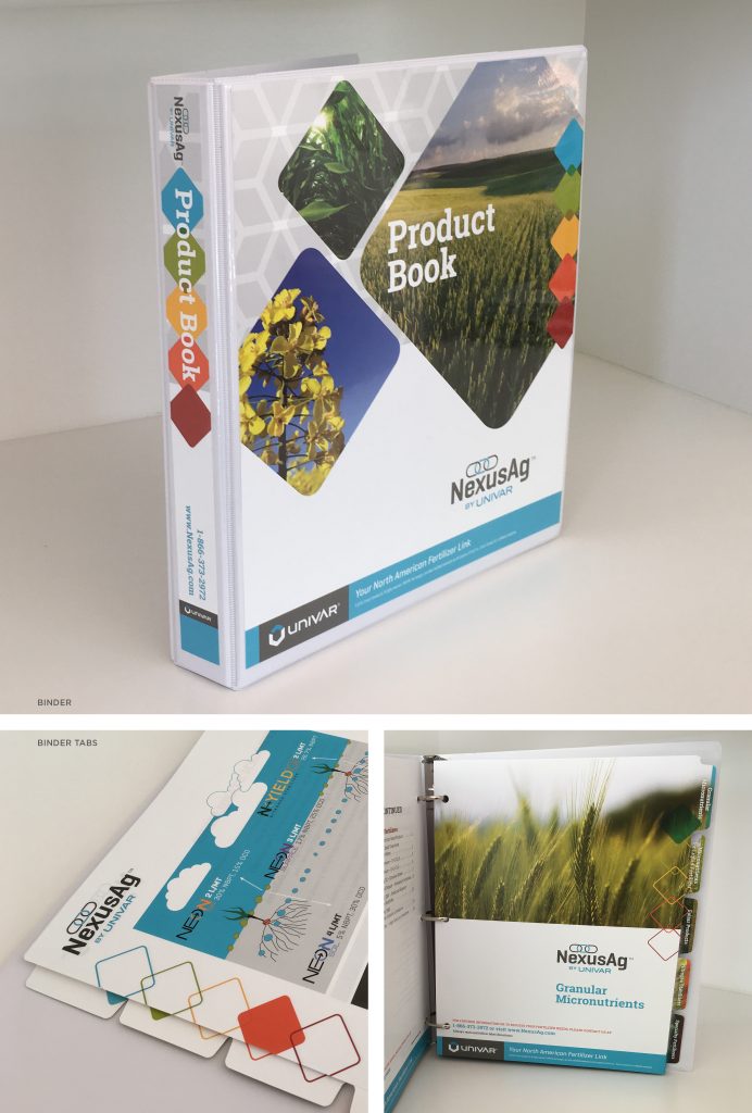
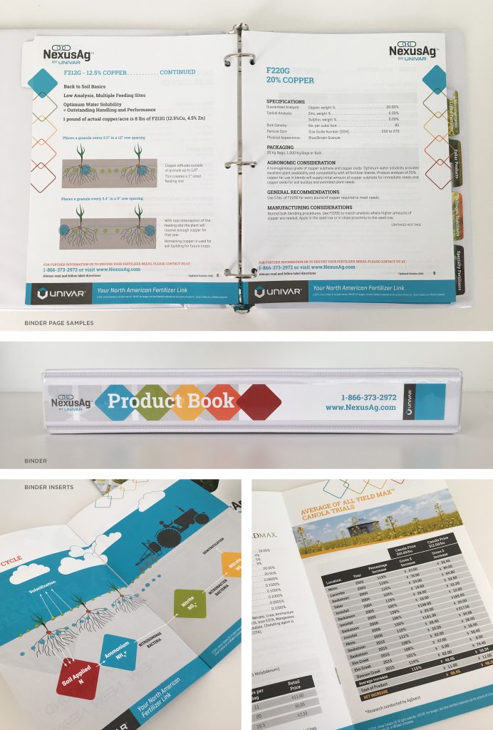
Binders are a great solution when you need an easy-to-update product book for distributors. Each product sheet is a stand-alone one-sheet as well, making it a versatile way to get a lot of information across. Using the UNIVAR brand palette, a colour-coded system was used to separate the different types of fertilizers, and is used throughout all marketing materials – including fertilizer sample jars. Smaller brochures with more generalized information are inserted into the binder to form a complete picture.
Q-Protect Brochure
| Submitted By: | Colin McFadyen | National Brand Communications |
|---|---|
| Job Title: | Quantum Biosciences Brochure |
| Client: | Quantum Biosciences |
| Client Business: | Agriculture |
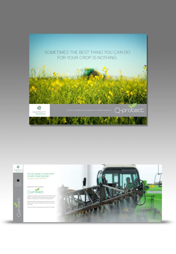
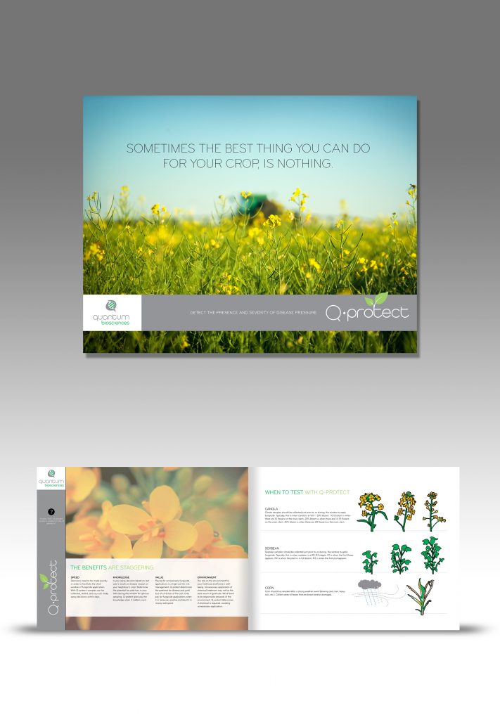
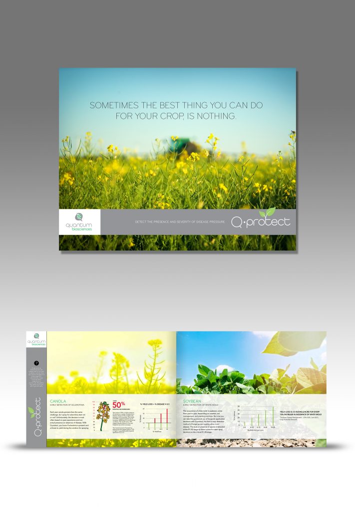
Q-Protect is a very specialized service where crops are DNA tested to detect the likelihood and presence of crop disease. The nature of the process and the benefits can be complicated to many, therefore this brochure cleanly and succinctly tells the story of Q-Protect.
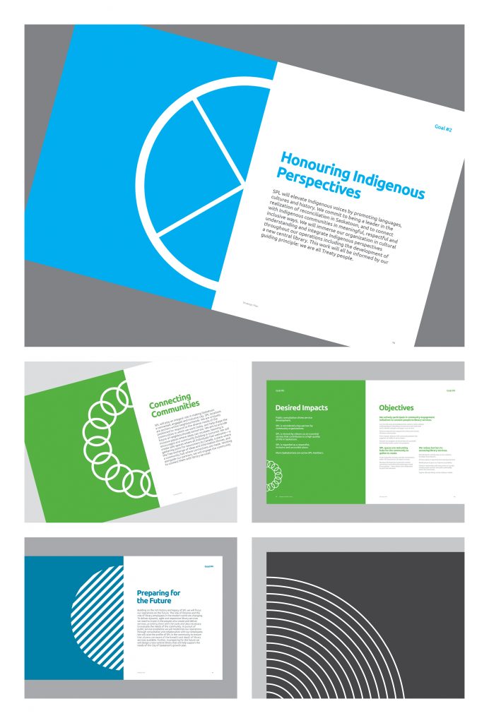
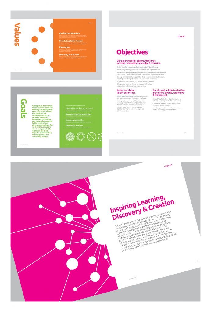
Saskatoon Public Library Strategic Plan: 2016 – 2021
| Submitted By: | Ryan Schmidt | Saskatoon Public Library |
|---|---|
| Job Title: | Graphic Designer |
| Client: | Saskatoon Public Library (SPL) |
| Client Business: | Library |
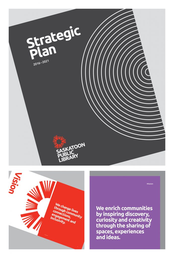
Saskatoon Public Library’s (SPL) Strategic Plan (2016-2021) sets forth an exciting and ambitious vision of growth, modernization and cultural progress for our organization. With Saskatoon witnessing rapid growth and technology constantly changing, this plan will help guide the critical and necessary evolution of SPL over the next five years.
The circular design was intended to make the content accessible and emphasize the role SPL plays in connecting communities across Saskatoon.
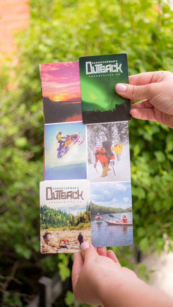
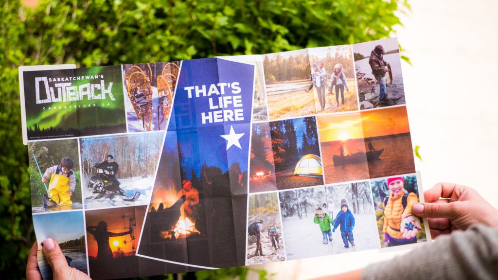
Carrot River Z-Card
| Submitted By: | Ryan Townend | William Joseph Communications |
|---|---|
| Job Title: | Graphic Designer |
| Client: | Carrot River Economic Development |
| Client Business: |
Design / D03 / LOGO
Vault Disposal Logo
| Submitted By: | Bravo Tango Advertising | Bravo Tango Advertising |
|---|---|
| Job Title: | Designer/Art Director |
| Client: | Vault Disposal |
| Client Business: | Oil & Gas |
Vault Disposal Ltd. is a Saskatchewan based oil and gas company that is directly involved in the clean-up and protection of land and soil that may have been impacted by contamination, spill and waste. The client requested an identity that evoked a sense of security and a message of safety among its target market, while promoting itself as environmentally safe.
Quarter Inch Quilt Shop Logo
| Submitted By: | Bravo Tango Advertising | Bravo Tango Advertising |
|---|---|
| Job Title: | Designer/Art Director |
| Client: | Quarter Inch Quilt Shop |
| Client Business: |
The Quarter Inch Quilt Shop is a quilting and fabric store in Melfort, Saskatchewan. The name Quarter Inch comes from the 1/4” seam allowance used in quilt construction. The logo combines quilting and sewing iconography (a quilting square, needle and thread) with typographic elements. The needle creates the slash in the 1/4” fraction and the thread loops to form a capital letter Q. When used with the company name, simple typography is set in a threaded square the same size as the logo square.
Acre 21
| Submitted By: | Bravo Tango Advertising | Bravo Tango Advertising |
|---|---|
| Job Title: | Acre 21 - Identity |
| Client: | Acre 21 |
| Client Business: | Retail Land Development |
Acre 21 references the 21 acres of land that this retail site occupies. The name is unique and holds a certain edge and personality. We felt this name would set this shopping area apart from others within the local market.
A logo design was required for a new mixed-use project located in Regina’s most affluent trade area. In order to appeal to this demographic, it needed to have a high end, sophisticated look and feel. Within the icon is the number “21” and the shape represents an acre of land.
Saskatchewan Library Association Logo
| Submitted By: | Christian Jensen | Christian Jensen Communications Design |
|---|---|
| Job Title: | Saskatchewan Library Association Logo |
| Client: | Saskatchewan Library Association |
| Client Business: | Libraries Association |
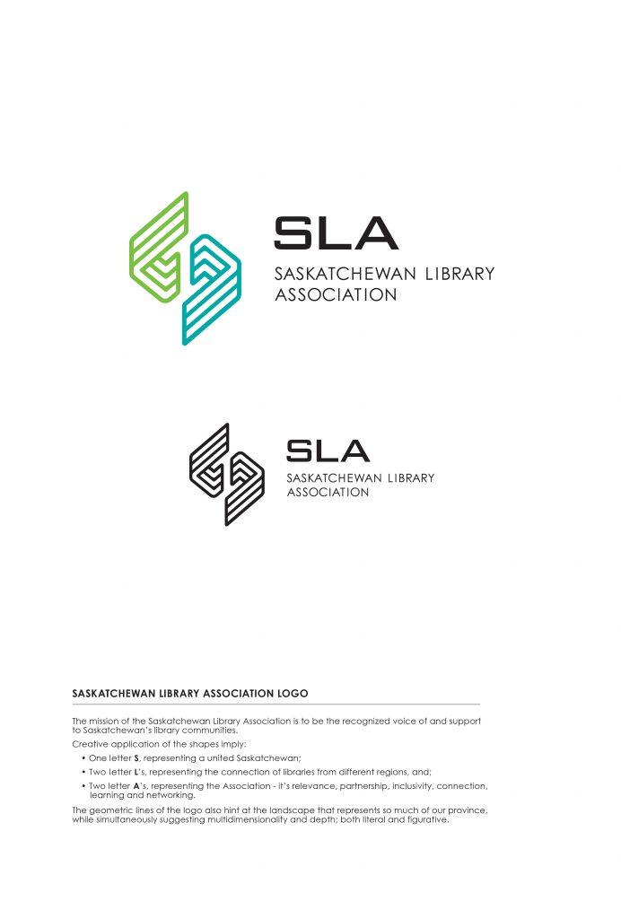
Objective: To design a visual ambassador for an association that provides information, advocacy, awareness, education, membership benefits and cultural opportunities for library workers and the public at large through its general operations and programs.
To this end, a creative application of shapes imply:
• One letter S, representing a united Saskatchewan;
• Two letter L’s, representing the connection of libraries from different regions, and;
• Two letter A’s, representing the Association – it’s relevance, partnership, inclusivity, connection, learning and networking.
The geometric lines of the logo also hint at the landscape that represents so much of our province, while simultaneously suggesting multidimensionality and depth; both literal and figurative.
ISEE Motion Picture Company
| Submitted By: | Colin McFadyen | National Brand Communications |
|---|---|
| Job Title: | ISEE Motion Picture Company - REBRAND |
| Client: | ISEE Motion Picture Company |
| Client Business: | Motion Picture Company |
ISEE is a full service film production and distribution company; serving broadcasters, film distributors, Video On Demand companies and corporate clients with “off-the-grid” content.
ISEE’s new focus is to really push the boundaries of ‘indie’ projects.
The new logo represents a little girl full of imagination and wonder with her own ‘unique’ twist.
Sentiments Home & Design
| Submitted By: | Jennifer Bews | The Authentic Voice |
|---|---|
| Job Title: | Graphic & Event Designer |
| Client: | Sentiments Home & Design |
| Client Business: | Interior Design & Decor |
Design a logo that expresses the sophistication of Sentiments Home & Design store.
The Make-Up Lounge & Style Bar – Logo
| Submitted By: | Logan Seidlik | Logan Seidlik Creative & Design |
|---|---|
| Job Title: | Graphic Designer |
| Client: | Clara Edvi, Jorge Antunes |
| Client Business: | The Make-Up Lounge & Style Bar |
The objectives for the project were as follows:
1. Create a relevant differentiation from existing Salons in the Regina Market.
2. Produce a mark that was not gender specific, as to appeal across the entire beauty market.
3. Establish a clear hierarchy of information in the structure of the logo. Making sure customers could easily parse the long business name.
ASTRONAUT CATS
| Submitted By: | Ryan Schmidt | |
|---|---|
| Job Title: | ASTRONAUT CATS LOGO |
| Client: | ASTRONAUT CATS ULTIMATE DISCSPORTS TEAM |
| Client Business: | ULTIMATE DISCSPORTS TEAM |
Venn Coffee Logo
| Submitted By: | Taylor Pfeifer | Fancy Creative Studio |
|---|---|
| Job Title: | Logo Design |
| Client: | Venn Coffee |
| Client Business: | Coffee Roaster |
The word “venn” is defined as an illustration of the relationships between and among sets, groups of objects that share something in common.
The mark itself is meant to resemble a venn diagram, while forming the shape of a tree. The word “venn” is also nordic for “friend”, and we chose triangles instead of circles as they are stronger and have more movement (and there are three partners). The colours are a nod to their prairie roots, adventurous spirit, and comforting “stay awhile” experience that the cafe is sure to boast.
The logo is a chunky, utilitarian style—in which you could almost see as a patch sewn onto a backpack, or burned into the wooden handle of an axe. That sensibility, is the very sense of adventure our client wants each of their customer’s to experience.
Design / D04 / BRAND / IDENTITY APPLICATION
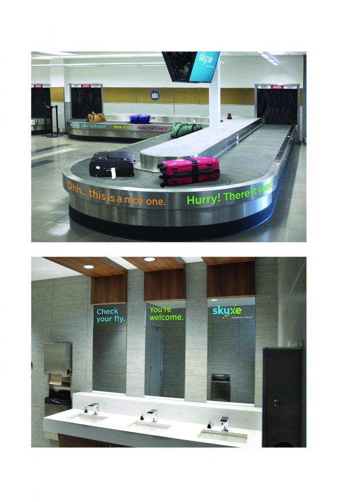
SKYXE
| Submitted By: | | LMNO |
|---|---|
| Job Title: | Saskatoon Airport Rebrand |
| Client: | Saskatoon Airport Authority |
| Client Business: | Transportation |
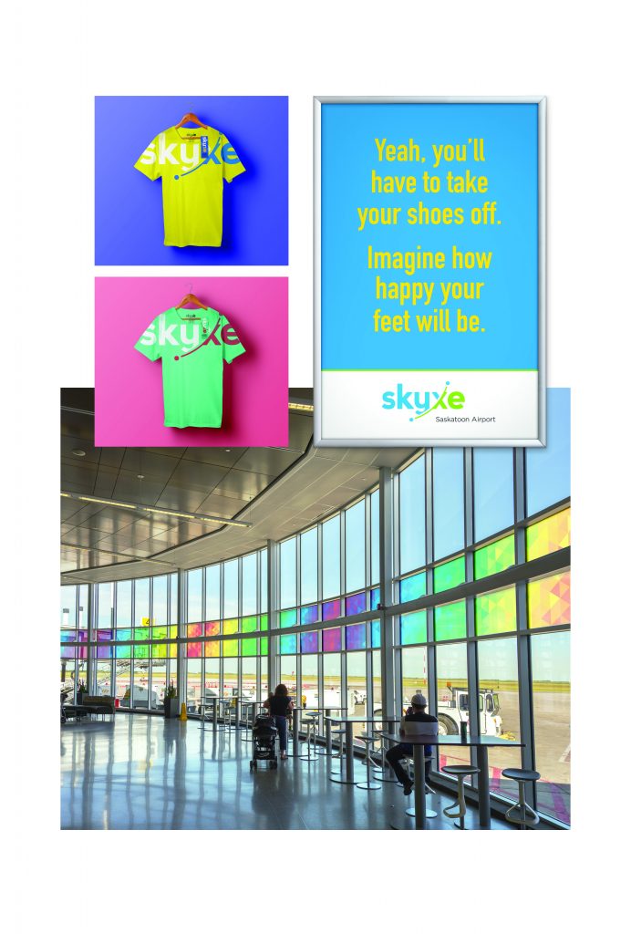
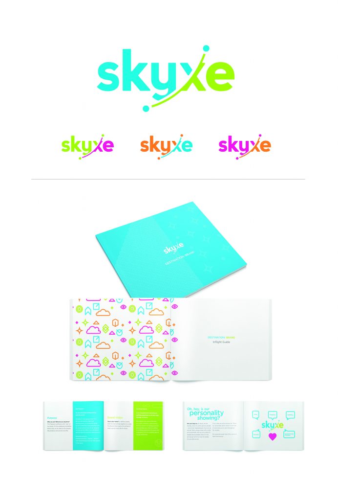
Create a friendlier, more enjoyable airport experience for travellers. Your vacation truly begins the second you walk through the doors.
X-110 Egg Protein Snacks Branding
| Submitted By: | Allan Dowdeswell | Confidant Communications |
|---|---|
| Job Title: | X-110 Egg Protein Snacks Branding |
| Client: | Evova Foods |
| Client Business: | Food Manufacturer |
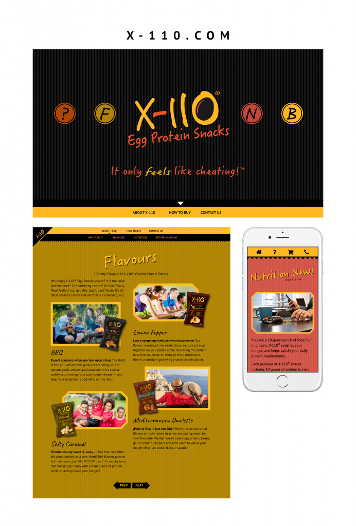
Challenge: Evova Foods had developed a new high-protein snack food made from eggs. The product had potential for several target markets including health and weight-conscious folk, athletes, and kids with bag lunches. Evova required both a name for the product and a visual identity that would appeal to all of the potential markets if possible, while standing out from the competition. The branding also needed to be versatile enough to allow for a unique character for each of their snack flavours.
Process: The job began with much research as to what other food products were currently available in Canada for each of the target markets. After discarding a few ideas we refocused on the main benefit of the product: its very high protein-to-calorie ratio which was ten grams vs. 110 calories. After checking on available trademarks I proposed the name “X-110” and their board loved the idea.
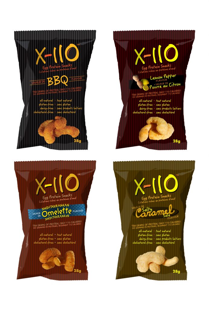
The logo and branding elements came together easily after that. I felt it was important to keep within a warm colour palette because this has been proven in research to evoke feelings of hunger. With all our target markets in mind I crafted the logo to be friendly and fun. The negative space of the zero proved to be an ideal space for alluding to the product’s egg origins. The background stripes were selected to add an elegant reminder of the stripes which were typical of popcorn stands of the past. They were also ideal as a stable design motif to contrast the informal diagonal design elements. The “parent” identity was the black and orange colour palette which is also used on the BBQ flavour packaging. The colour schemes of the three other packages were selected to complement the related flavour and to keep in the warm colour palette: golden for caramel, reddish for tomato, and yellow for lemon.
Result: As part of Evova’s marketing campaign, X-110 is gaining a lot of interest via social media, and has collected 396 page “likes” at the time of this writing. Evova is now preparing X-110 for a major release in grocery outlets across Saskatchewan.
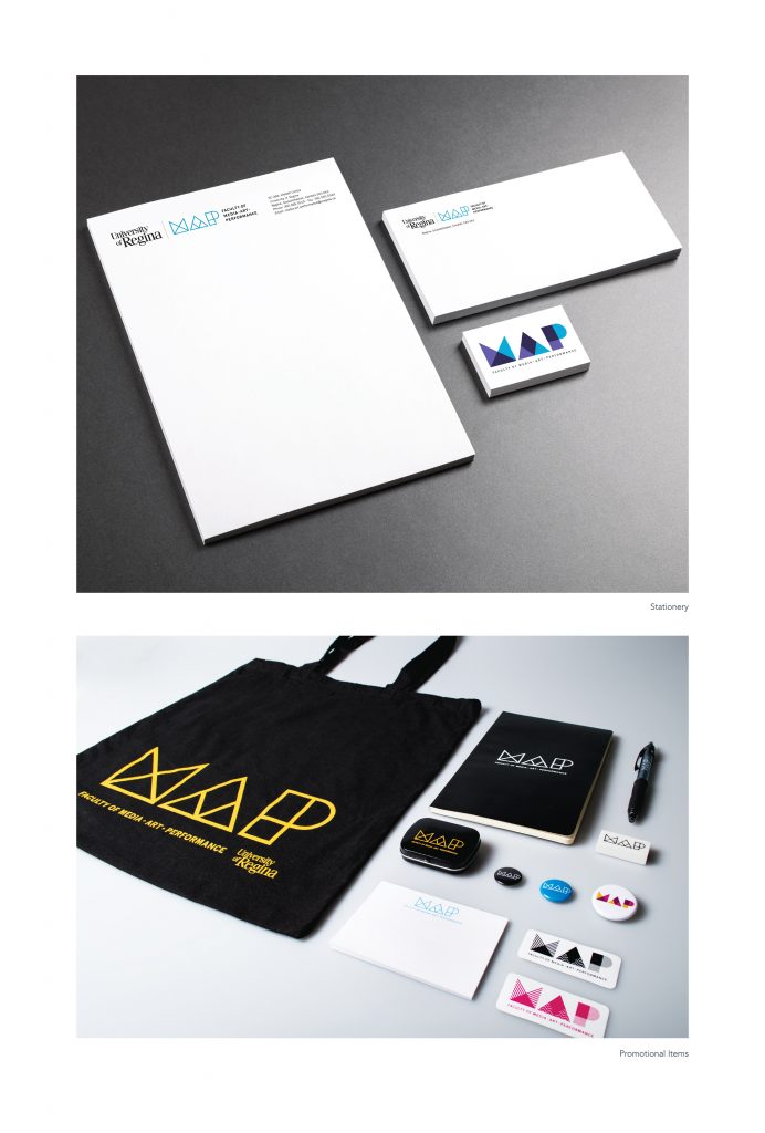
MAP Identity
| Submitted By: | Bravo Tango Advertising | Bravo Tango Advertising |
|---|---|
| Job Title: | Designer/Art Director |
| Client: | University of Regina - Faculty of Media, Art, and Performance |
| Client Business: | Education |
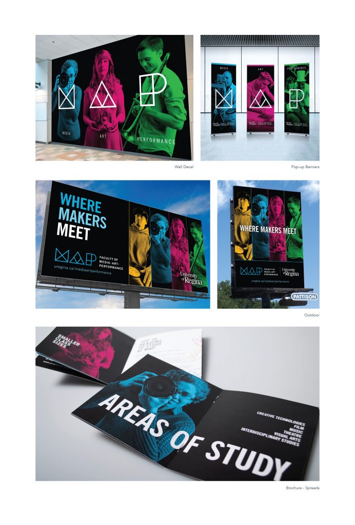
The Faculty of Fine Arts at the University of Regina was at risk of becoming irrelevant. In an ever-evolving age of new technologies, the Fine Arts title seemed dated and out of touch. A new name was developed internally, and the faculty of Fine Arts was reborn as MAP (The Faculty of Media, Art, And Performance). We worked with the faculty over a period of several months to create an entirely fresh brand, including a dynamic logo, tagline, and broad visual language. The new identity better articulates the cutting-edge classes and technologies available to students, and resonated strongly with the target audience. The tagline “Where Makers Meet” promotes the concept of collaboration and what MAP is all about. Launched in the Spring of 2016, the new MAP identity was enthusiastically received by students, faculty, and the community at large. The initial launch campaign included a wide array of mediums including outdoor, television, cinema, online, print, banner ads, social media posts, and various unique promo pieces.
REFUEL YXE branding – John G. Diefenbaker International Airport
| Submitted By: | Christian Jensen | Christian Jensen Communications Design |
|---|---|
| Job Title: | REFUEL YXE branding - John G. Diefenbaker International Airport |
| Client: | Kindrachuk Agrey Architecture |
| Client Business: | Architecture |
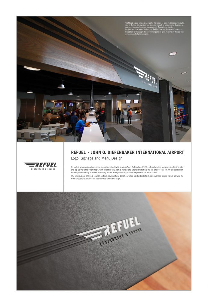
Objective: To design a brand, including logo, menus and primary signage for an amazing new restaurant designed as part of the gorgeous new airport expansion in Saskatoon.
A simple, clean and bold solution portrays movement and transition, with a subdued palette of grey, silver and natural walnut allowing the many arresting features of the restaurant to take center stage.
Working with Laser Impressions of Saskatoon in fabrication of the sign – I built the solid walnut portion of the sign in my workshop and they constructed the other side to my specs, with all spraying being being done in my shop. The menu covers were beautifully produced by Universal Bindery.
Kindrachuk Agrey Architecture Branding
| Submitted By: | Christian Jensen | Christian Jensen Communications Design |
|---|---|
| Job Title: | Kindrachuk Agrey Architecture Branding |
| Client: | Kindrachuk Agrey Architecture |
| Client Business: | Architecture |
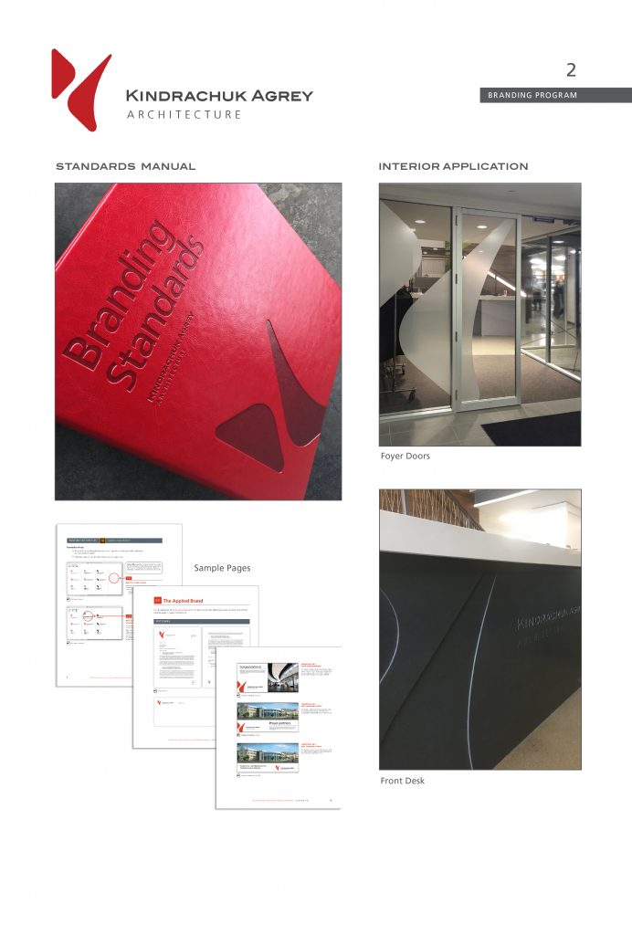
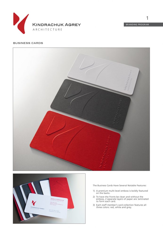
Objective: To develop a visual brand to represent Kindrachuk Agrey Architecture’s collective principles, spirit and culture.
The firm’s reputation for high quality of design and experience can be seen in the logo’s elegance, confidence and purposeful simplicity.
Reflecting a commitment to sustainability, community and relationships, the brand and logo embody a holistic approach who’s elements, while physically separated and unique from each other, spatially collaborate to achieve something fresh and new; something far more than the sum of their parts.
With purposeful disregard for beaten path and well-worn convention, the logo embodies design innovation, creativity, and passion through it’s boldly unique, yet practical approach.
Movement and energy are heightened through the eye’s natural journey through the white space and the effortless choreography between the two shapes. The equally purposeful and simple applications of the logo serve to strengthen this spirit.
CNYC Rebrand
| Submitted By: | David Melashenko | David Melashenko Design + Advertising |
|---|---|
| Job Title: | CNYC Rebrand |
| Client: | CNYC |
| Client Business: | Non-profit organization for at-risk youth |
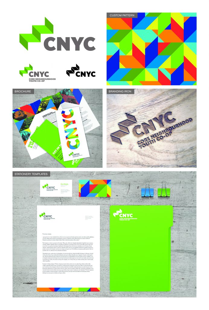
Saskatoon’s Core Neighbourhood Youth Co-op (CNYC) is a grassroots organization living on individual donations and small grants, while doing amazing things for at-risk youth living in Saskatoon. To make CNYC a contender for game-changing grants and corporate sponsorship, a new visual identity was recommended.
The ‘steps’ icon represents the life skills that participants gradually develop. It is also a subtle nod to the rooflines of the CNYC home base.
A vibrant colour palette was requested to make a reference to their previous branding. A geometrical pattern, inspired by First Nations star blankets, was developed.
Aside from the visual identity, other projects included stationery templates, an informational brochure, and a branding iron to label carpentry projects.
Makerspace Brand Development
| Submitted By: | Taylor Pfeifer | Fancy Creative Studio |
|---|---|
| Job Title: | Brand Development |
| Client: | Saskatoon Marketplace |
| Client Business: | Collaborative Workshop |
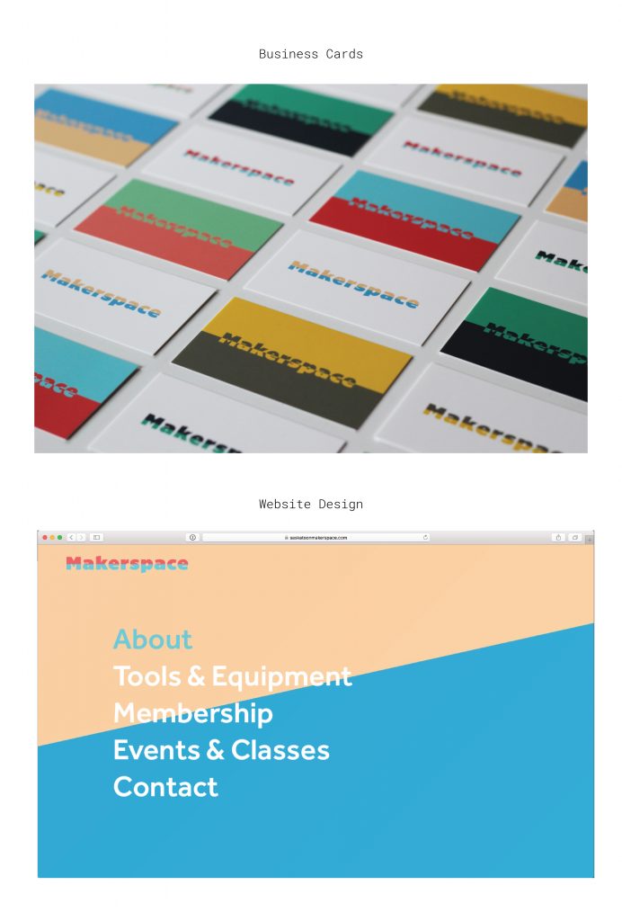
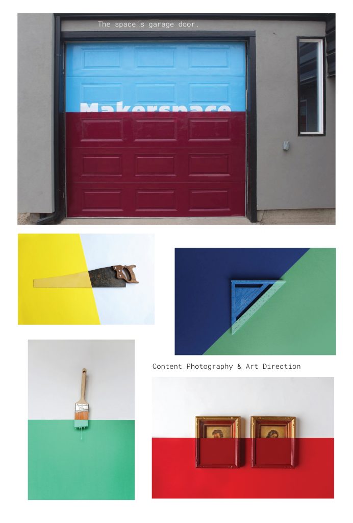
After careful deliberation we took the route of creating a logo system to allow for the word mark and idea to take on different shapes and work in different contexts. The system ties into the idea of collaboration, mismatched tools/materials, and the mashup of good things coming together. The inspiration came from a style of post-modern/re-purposed art that had old portraits dipped in a single coat of bright paint, the idea that even something complete could be transformed or re-imagined with one simple act. This form of art worked perfectly with the selected logo type, allowing for Devon and his team to select multiple colours, patterns and finishes for his brand.
Drop & Go Brand Development
| Submitted By: | Taylor Pfeifer | Fancy Creative Studio |
|---|---|
| Job Title: | Brand Development |
| Client: | SARCAN |
| Client Business: | Beverage Container |
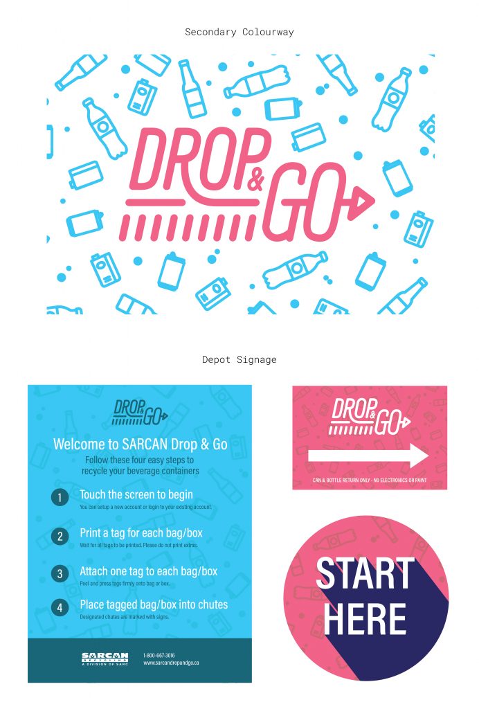
Sydney and Sean contacted us to create a visual identity that separated itself from their current branding. The goal was to design an identity that would represent the new program and help attract a missed target market in hopes of increasing Drop & Go’s usage and the amount of recyclables being returned to the depots in Saskatchewan.
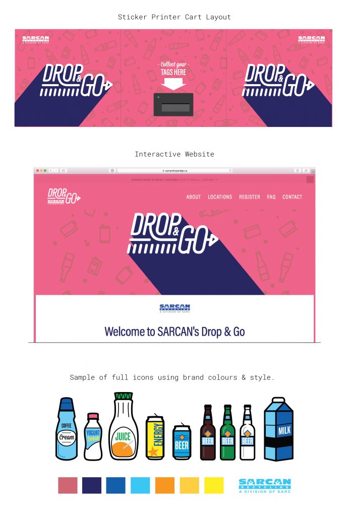
Once it came time to imagining a visual identity, we started by doodling ideas by hand with good, old fashioned, pencil and paper. This ultimately led us to a custom typography, word mark approach for the Drop & Go logo. The text itself indicates quick movement from the “Drop” falling to the “R” forming an arrow within the “Go”. In many instances, you will see the logo paired with a background of falling recyclables allowing for us to introduce vibrant colours for contrast.
Design / D05 / EVENT MATERIALS
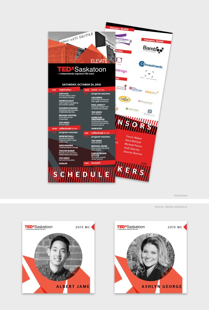
TEDxSaskatoon Event Materials
| Submitted By: | Cheryl McDougall | OneOliveDesign |
|---|---|
| Job Title: | TEDxSaskatoon Event Materials |
| Client: | |
| Client Business: |
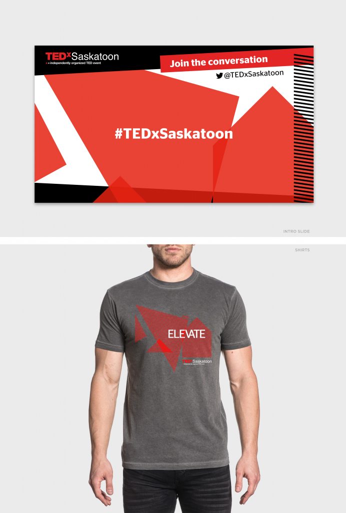
The need for a dynamic, cohesive, and unique set of graphics was required for this event – all while staying within the rigid TEDx guidelines. Creating a small, folded program to fit into the nametag holder made it cost-effective for the hosts, and convenient for the guests.
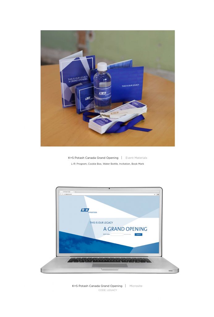
K+S Potash Canada Grand Opening – Event Materials
| Submitted By: | Dean Owen | MGM Communications |
|---|---|
| Job Title: | K+S Potash Canada Grand Opening |
| Client: | K+S Potash Canada |
| Client Business: | Potash |
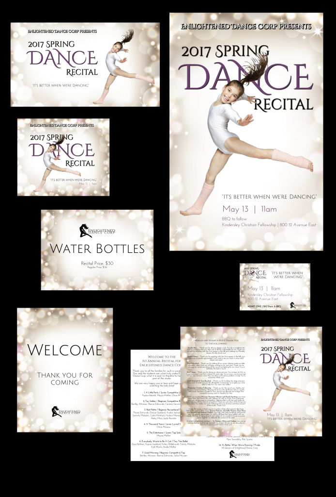
It’s Better When We’re Dancing
| Submitted By: | Jennifer Bews | The Authentic Voice |
|---|---|
| Job Title: | Graphic & Event Designer |
| Client: | Enlightened Dance Corp |
| Client Business: | Dance Studio |
Design all marketing collateral and event signage/collateral for Enlightened Dance Corps 2017 Dance Recital.
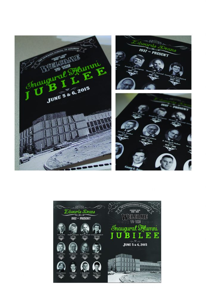
Alumni Jubilee Event 2015
| Submitted By: | Larry Kwok | Edwards School of Business, University of Saskatchewan |
|---|---|
| Job Title: | Marketing Coordinator |
| Client: | Edwards School of Business |
| Client Business: | Post-secondary Business Education |
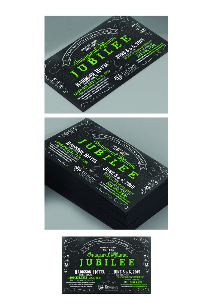
The first Edwards School of Business Alumni Jubilee event is an alumni reunion celebrating graduates from 1950-1965. These grads were the first to experience the new tradition of hosting an alumni event annually and thus it was important for marketing material to be eye catching and memorable. All event materials focused on establishing a sense of nostalgia and history. The concept of using chalk writing and classic blackboard backgrounds allowed alumni to reminisce, since these were primary items used for education during time in the college. The invitation cards were the first point of contact guests would receive in the mail. The event program cover matched in design and continued the idea of history with a classic photo illustration of the building they remember when attending college, as well as a listing of all past deans on the back cover. Each attendee received a nametag displaying their gradation photo and year to establish feelings of nostalgia, but it was also to contribute to icebreakers and conversation starters.
Design / D06 / PUBLIC SERVICE / CHARITY
RUHF Branding & Launch Campaign
| Submitted By: | | LMNO |
|---|---|
| Job Title: | Hospital Foundation Rebrand |
| Client: | Royal University Hospital Foundation |
| Client Business: | Hospital Foundation |
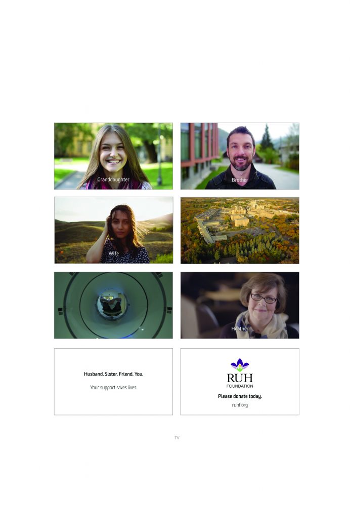
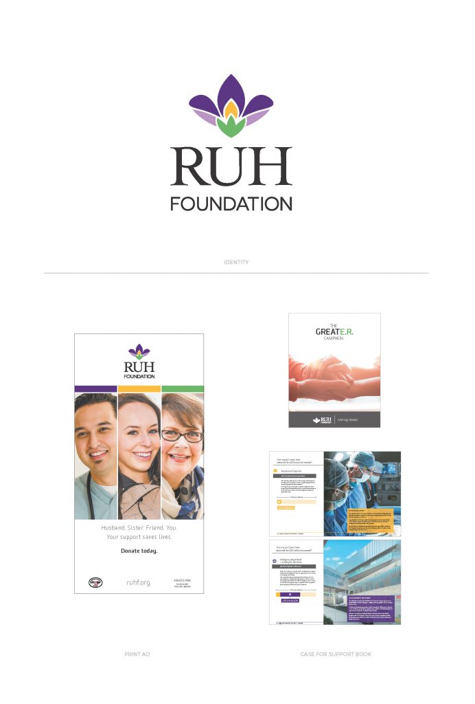
Update and improve the look of the Royal University Hospital Foundation brand to help increase positive perception and support, leading to donations.
2016 Lung Challenge
| Submitted By: | David Melashenko | David Melashenko Design + Advertising |
|---|---|
| Job Title: | 2016 Lung Challenge |
| Client: | Lung Association of Saskatchewan |
| Client Business: |
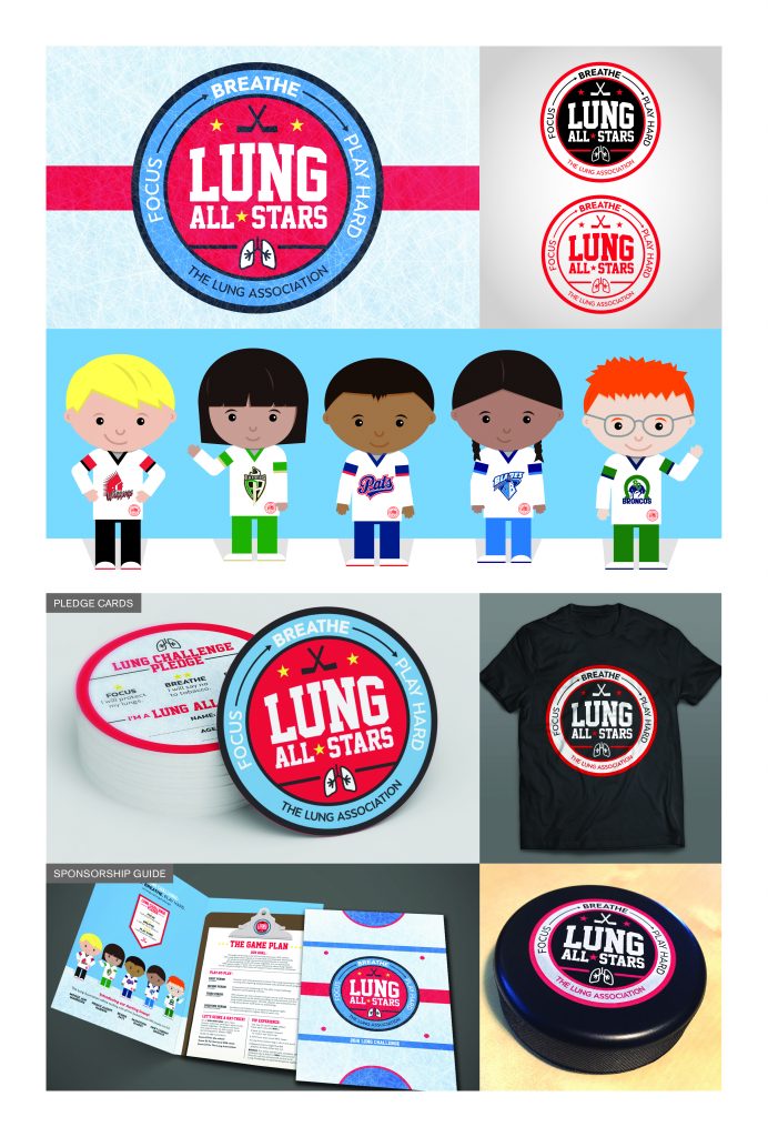
The Lung Association of Saskatchewan needed a new look for their annual Lung Challenge materials. This program is aimed at young elementary students, and features WHL players putting on presentations to schools about lung health. There is also a fundraising element where students sell tickets to sponsored game nights. All five of the Saskatchewan WHL teams needed to be represented equally.
Rather than focusing on photos of the WHL players (like previous years), I developed visuals with more appeal to kids in the target demographic. Diversity was important, so all kids would feel like this program is for them. I created the ‘Lung All-Stars’, with an illustrated character to represent each Saskatchewan team. I also designed a badge-style logo, to give the numerous swag items a bold and sporty look.
Some of the other materials were a sponsorship guide, and round pledge cards.
Design / D07 / EDITORIAL / MAGAZINE
AgriSuccess Special Edition
| Submitted By: | Farm Credit Canada | Farm Credit Canada |
|---|---|
| Job Title: | Marketing |
| Client: | Farm Credit Canada |
| Client Business: | Financial Services |
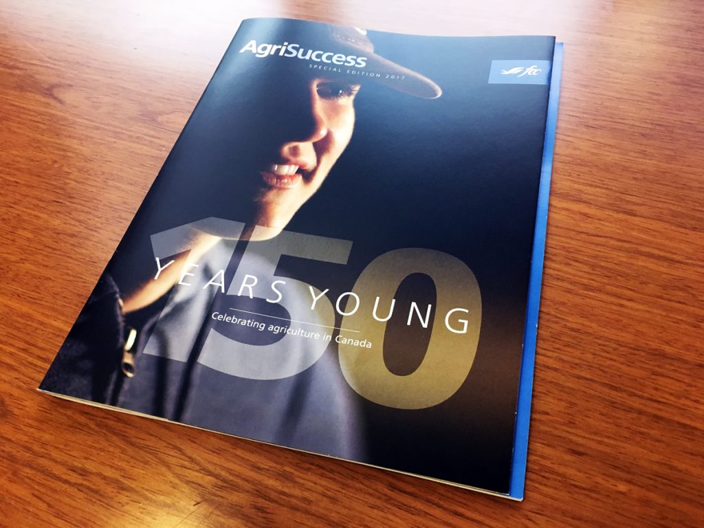
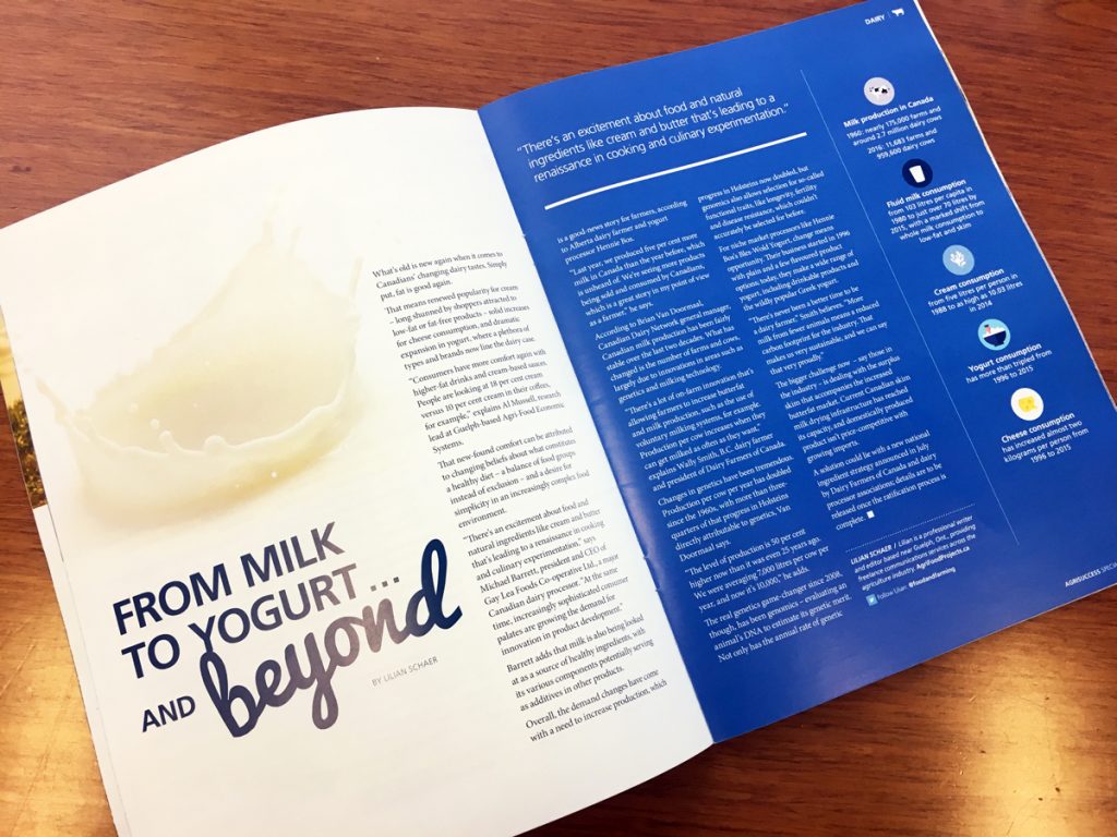
AgriSuccess is a bi-monthly national magazine produced by Farm Credit Canada that focuses on farm management skill development and success stories in agriculture. The magazine content is meant to inform, educate and equip Canadian farmers and advance the business of agriculture. Our 79,000 subscribers are producers from across Canada invested in growing and diversifying their operation and retaining a healthy profit.
To honour Canada’s 150th, a special edition of AgriSuccess was developed. The objective was to create a magazine celebrating 150 years of Canadian agriculture. The design had to be special enough to set the magazine apart from previous editions, but still fit within the defined and well-known brand our readers are familiar with. The cover stepped away from our usual masthead and was printed with a spot varnish to bring attention to the ‘150’ and the FCC logo. The edition also included a pull-out timeline of 150 years in agriculture and introduced typography and images we haven’t used in the past. Response to the special edition was very positive.
Design / D08 / PACKAGING
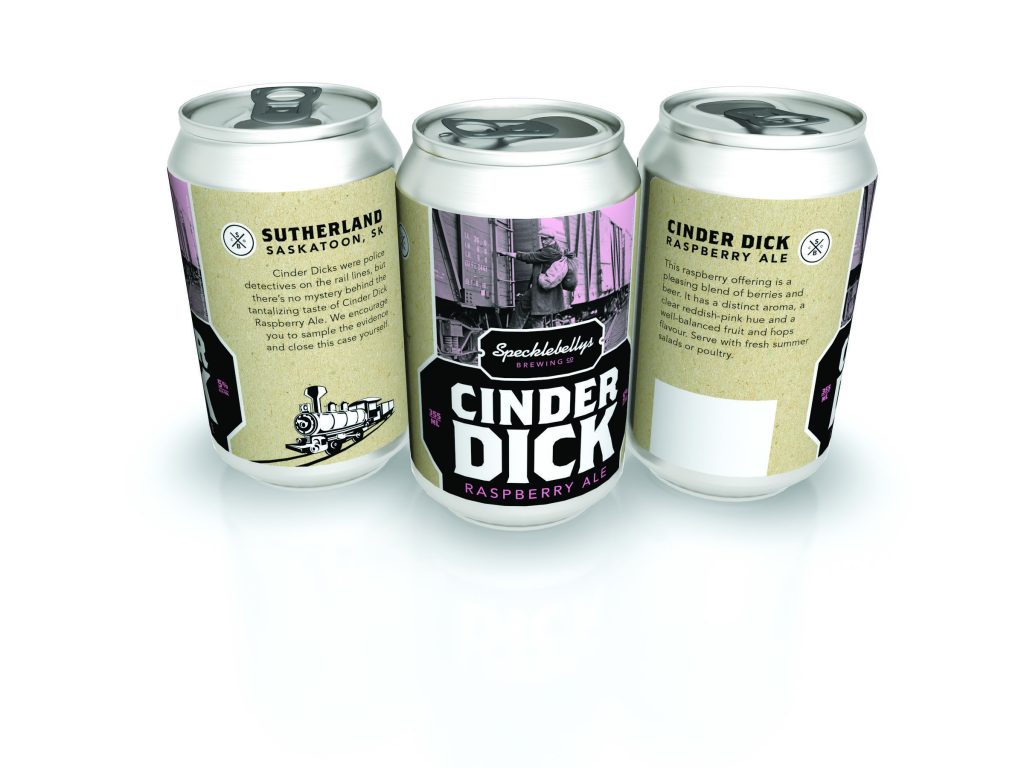
Nice Cans
| Submitted By: | | LMNO |
|---|---|
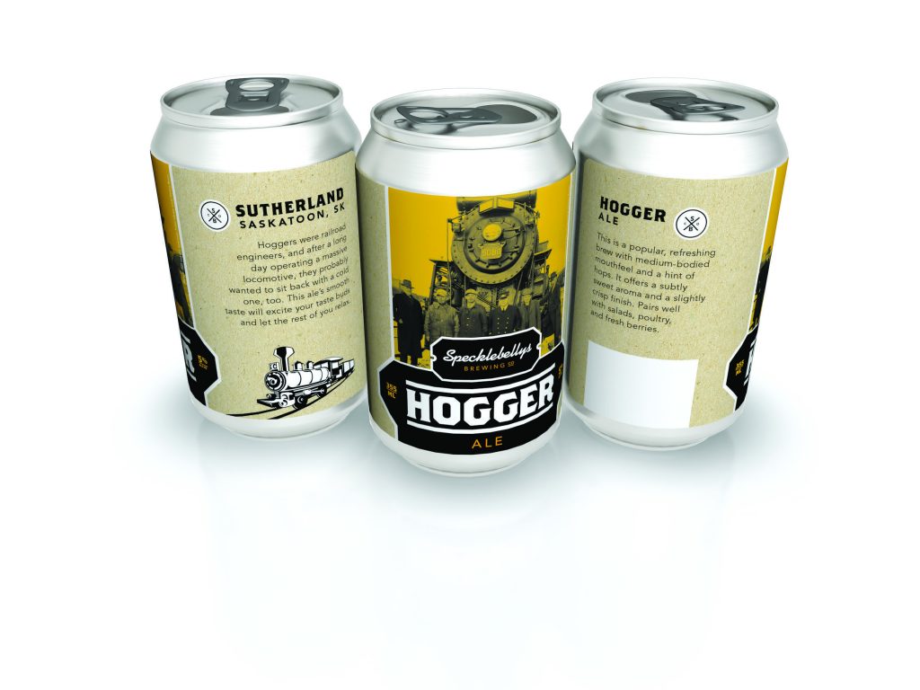
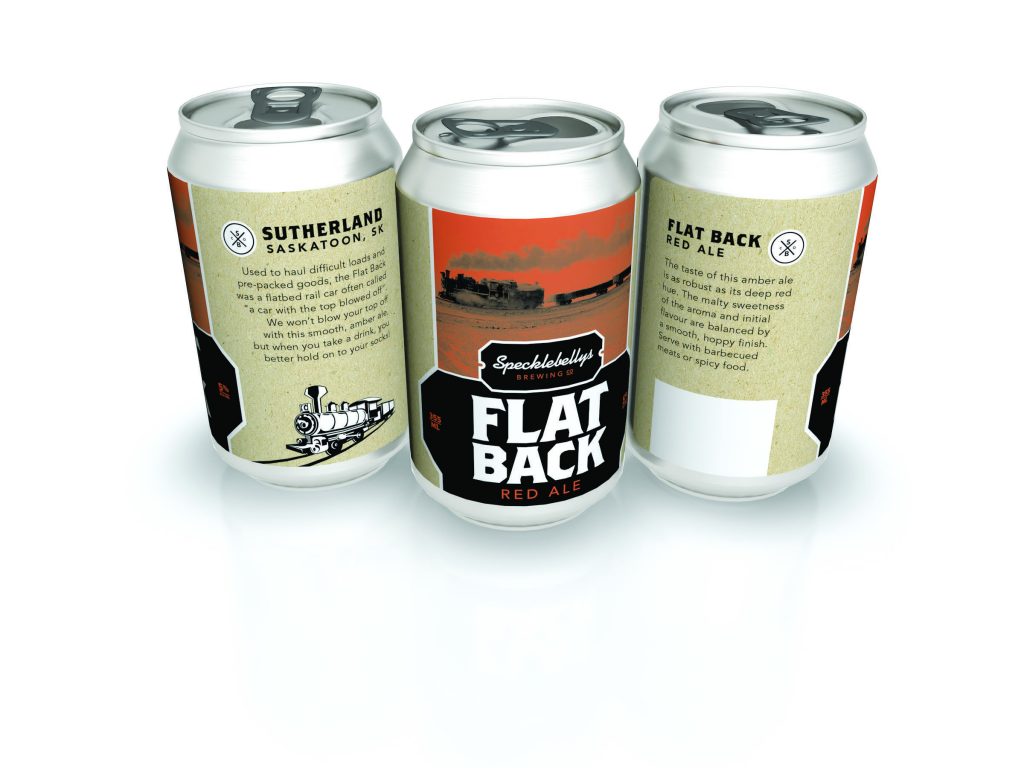
| Job Title: | Craft Brew Labels |
| Client: | Specklebelly's |
| Client Business: | Beer |
Create compelling and interesting packaging and naming evocative of Specklebelly’s location in Sutherland – an area with a history of railroading.
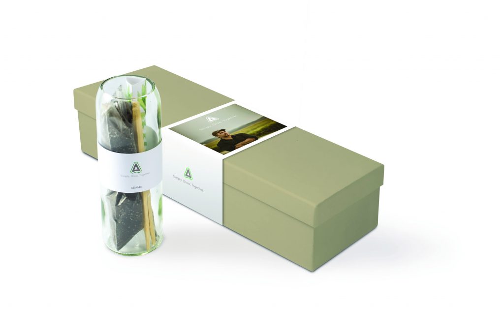
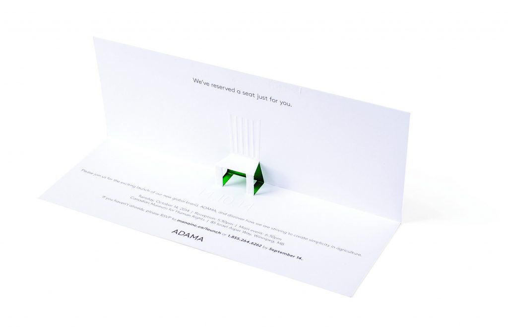
Terrarium To-go
| Submitted By: | | LMNO |
|---|---|
| Job Title: | Launch Promo/Invite |
| Client: | Adama |
| Client Business: | Agriculture |
Invitation and engagement piece to invite existing customers to the launch event for the new brand.
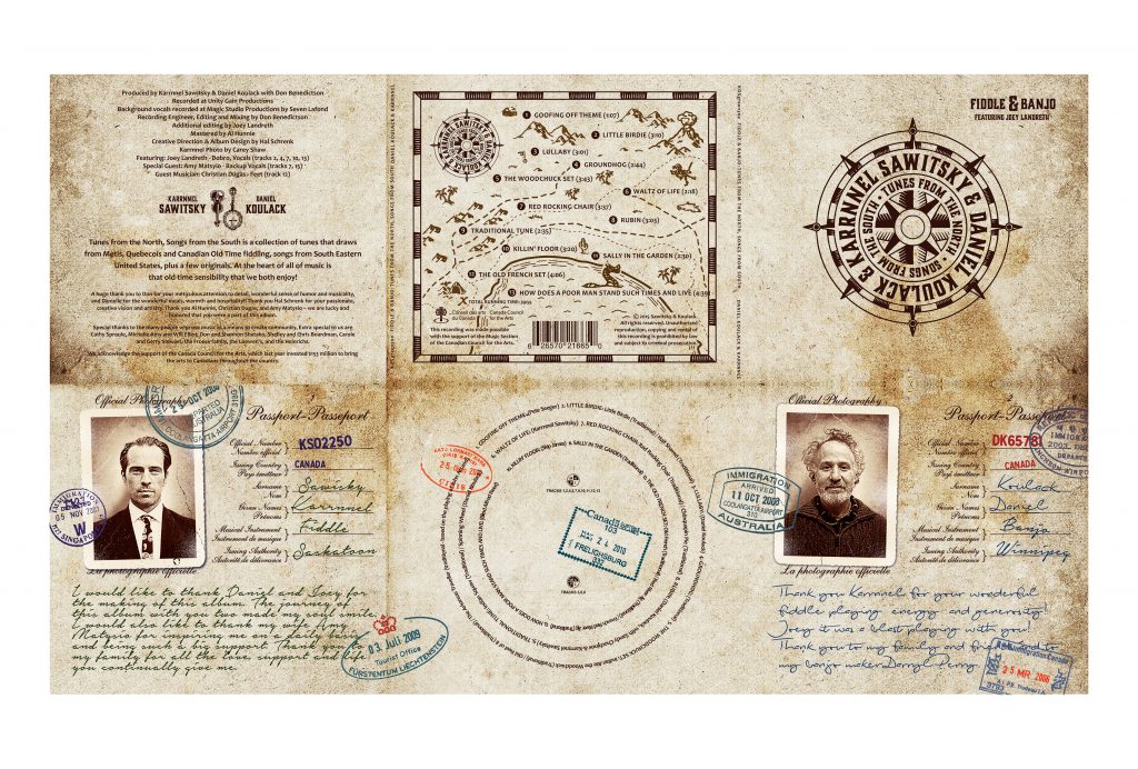
Tunes From The North-Songs From The South
| Submitted By: | Hal Schrenk | Hal Schrenk Graphic Design |
|---|---|
| Job Title: | Banjo and Fiddle |
| Client: | Karrnnel Sawitsky |
| Client Business: | Muscian |
Design a CD package which represents the heritage of Metis, Quebecois and Canadian Old Time fiddling. Since the pair of musicians were on tour a photo shot was out of the question, instead iPhone photos were used and aged to fit with the passport theme. Illustration and aged paper completed the design with the promise of a treasure map of music.
Spice Set
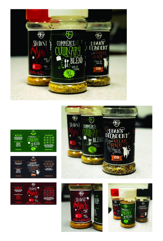
| Submitted By: | Larry Kwok | Edwards School of Business, University of Saskatchewan |
|---|---|
| Job Title: | Marketing Coordinator |
| Client: | Edwards School of Business |
| Client Business: | Post-Secondary Business Education |
The goal was to produce a promotional item to advertise the Edwards School of Business. As a gift given to donors, students, and guest speakers, the item needed to be something the recipient would use rather than a item they would immediately discard. The challenge included brainstorming clever names relating to the business education as well as describing the flavour of each spice. It was also important for each spice design to differentiate from each other, but also look cohesive, like they all belong within the same design family.
Design / D09 / ENVIRONMENTAL / EXHIBIT / SIGNAGE OR GRAPHICS
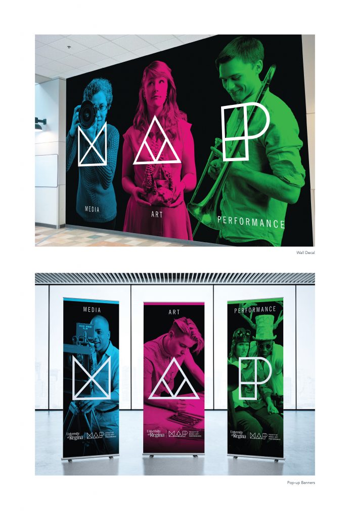
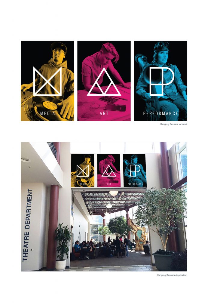
MAP – Environmental
| Submitted By: | Bravo Tango Advertising | Bravo Tango Advertising |
|---|---|
| Job Title: | Designer/Art Director |
| Client: | University of Regina - Faculty of Media, Art, and Performance |
| Client Business: | Education |
The Faculty of Fine Arts at the University of Regina was at risk of becoming irrelevant. In an ever-evolving age of new technologies, the Fine Arts title seemed dated and out of touch. A new name was developed internally, and the faculty of Fine Arts was reborn as MAP (Faculty of Media, Art, and Performance). We worked with the faculty over a period of several months to create an entirely fresh brand. Shown here is wall decals, hall banners and pop-up banners.
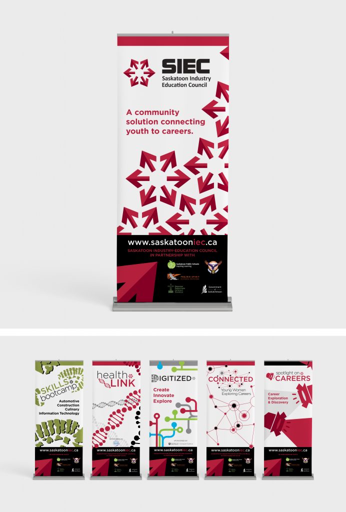
SIEC bannerstands
| Submitted By: | Cheryl McDougall | OneOliveDesign |
|---|---|
| Job Title: | SIEC bannerstands |
| Client: | |
| Client Business: |
A complete set of bannerstands was needed for SIEC – to be used together or separately. Each program required a logo (or logo refresh in some cases) and supplementary graphics – a new colour palette was created and used throughout for a cohesive look.
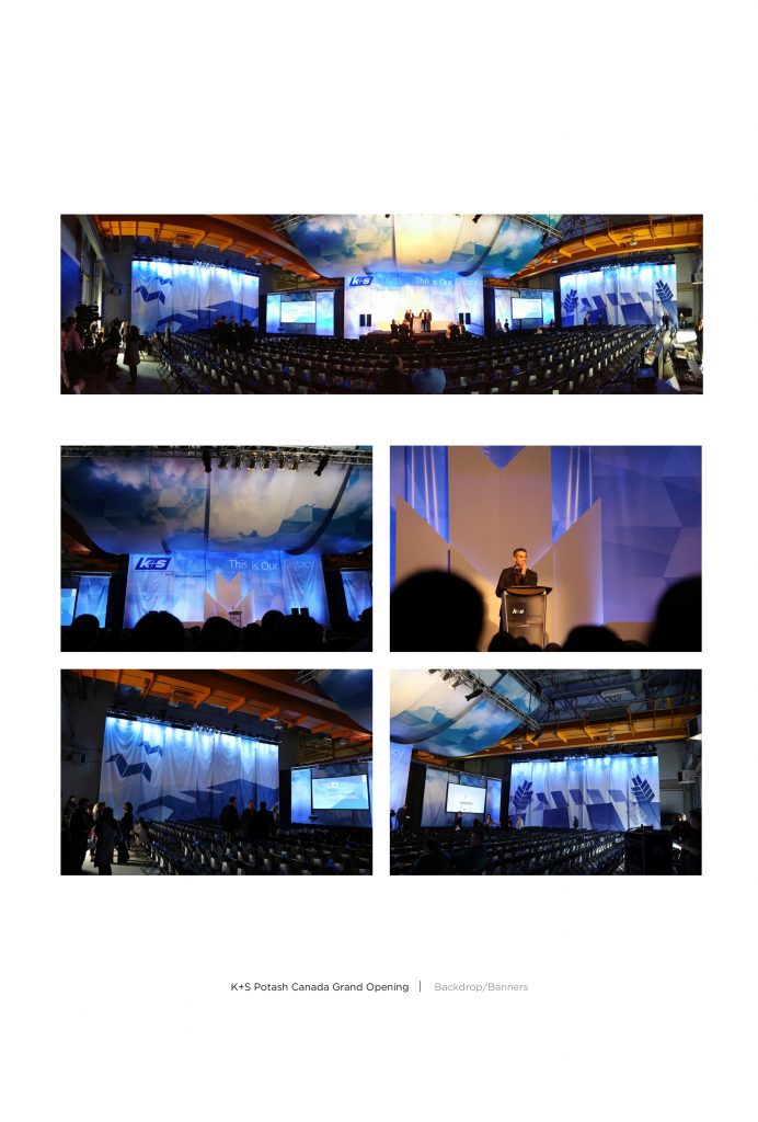
K+S Potash Canada Grand Opening – Backdrop/Banners
| Submitted By: | Dean Owen | MGM Communications |
|---|---|
| Job Title: | K+S Potash Canada Grand Opening |
| Client: | K+S Potash Canada |
| Client Business: | Potash |
Design / D10 / WEBSITE
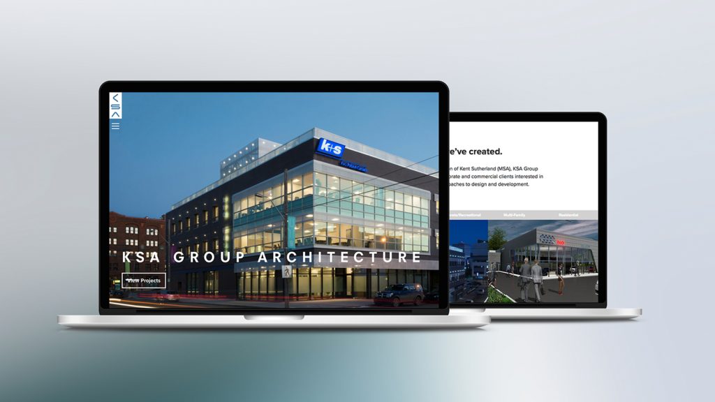
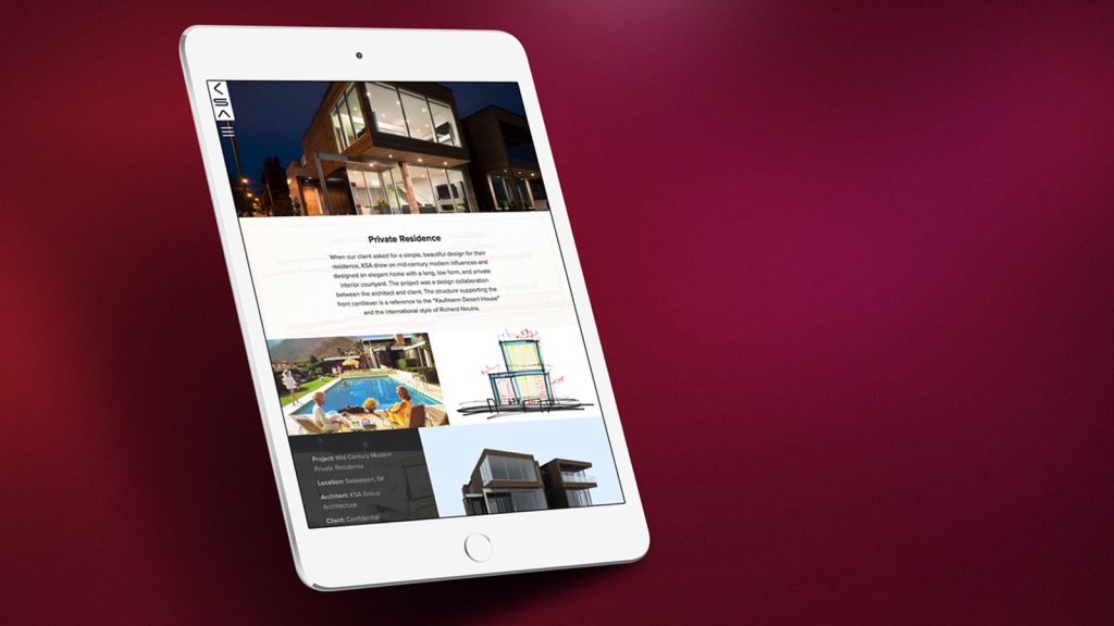
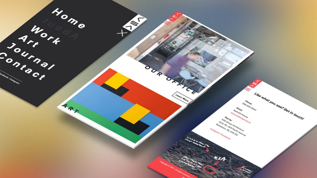
KSA Group
| Submitted By: | Andrew Scott | Island Collective Inc |
|---|---|
| Job Title: | KSA Group Website Redesign |
| Client: | KSA Group Architecture |
| Client Business: | Architecture |
The goal was to create a professional website that showcased the quality work and unique personality of the KSA Group.
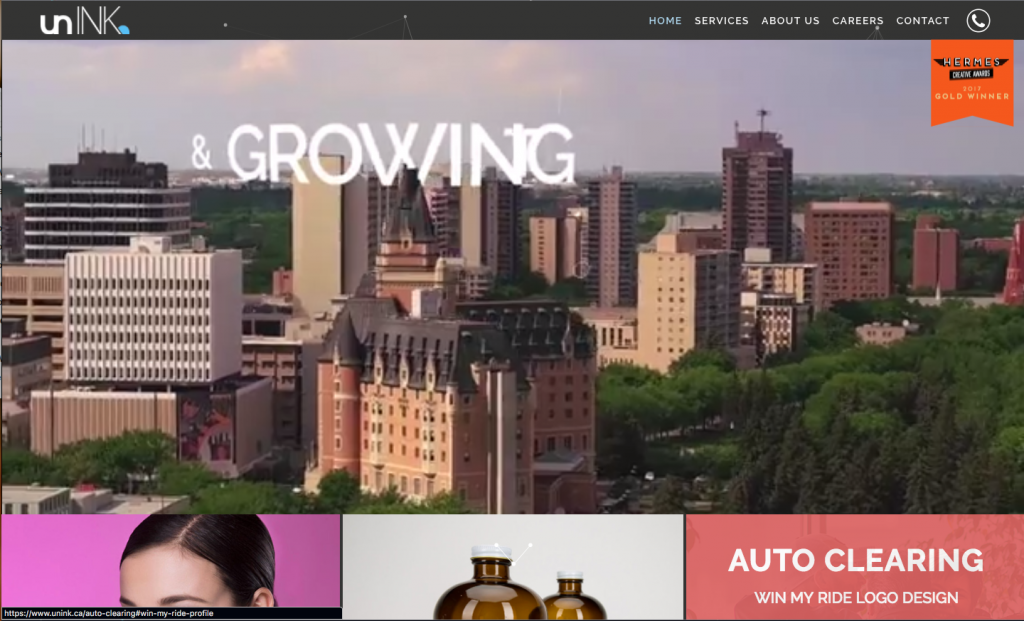
unINK Marketing & Creative Agency Website
| Submitted By: | Dustin Ratzlaff | unINK Marketing & Creative Agency |
|---|---|
| Job Title: | CEO |
| Client: | unINK Marketing & Creative Agency |
| Client Business: | Graphic & Web Design Services |
This digital property was created to showcase beauty, performance, and responsiveness expressed on a website. It highlights the values of unINK as a company, the unique perspective it holds hailing from a small city like Saskatoon, and the work achieved by the agency, both in the marketing and design worlds.
Spex By Ryan – Website
| Submitted By: | Logan Seidlik | Logan Seidlik Creative & Design |
|---|---|
| Job Title: | Graphic & UI Designer |
| Client: | Ryan Horne |
| Client Business: | Spex By Ryan |
The objectives for the project were as follows:
1. Give the user a similar experience to shopping in-store.
2. Tailor the content specifically to how the client produces it, in this case a large focus on Instagram and video projects.
3. Establish a frame-work for the later implementation of an online store.
Design / D11 / POSTER
CN Rail Military Poster
| Submitted By: | Dean Owen | MGM Communications |
|---|---|
| Job Title: | CN Rail Military Poster |
| Client: | CN Rail |
| Client Business: | Trains |
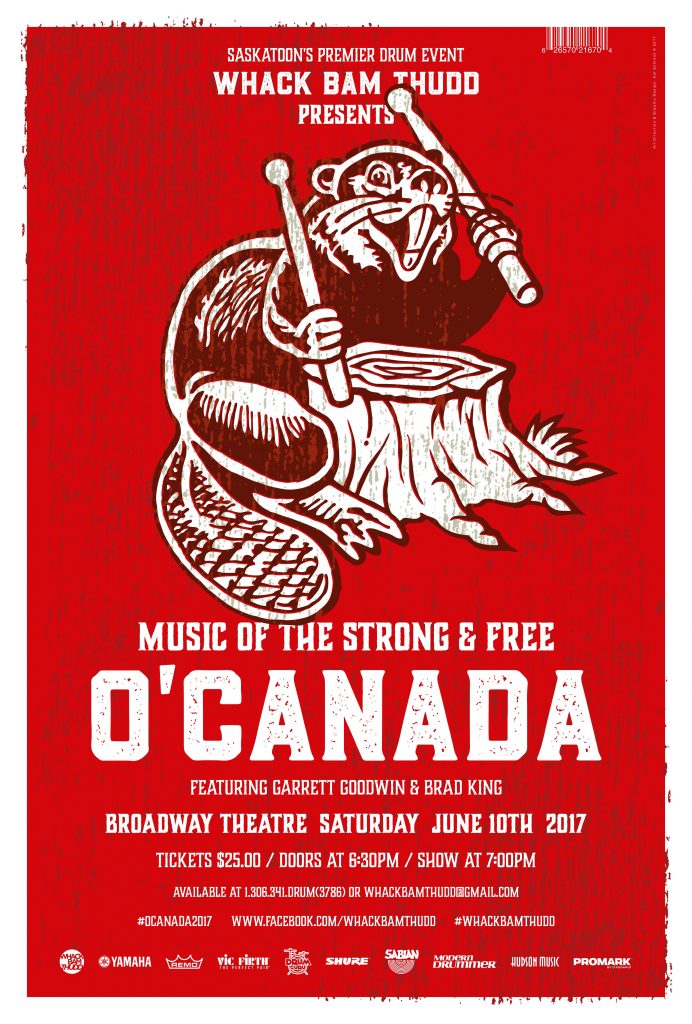
Benny the Beaver
| Submitted By: | Hal Schrenk | Hal Schrenk Graphic Design |
|---|---|
| Job Title: | O'Canadav |
| Client: | WhackBam Thudd |
| Client Business: | Educate and Promote Drumming |
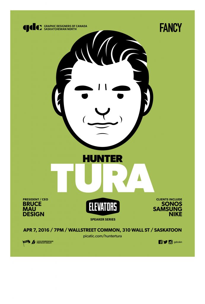
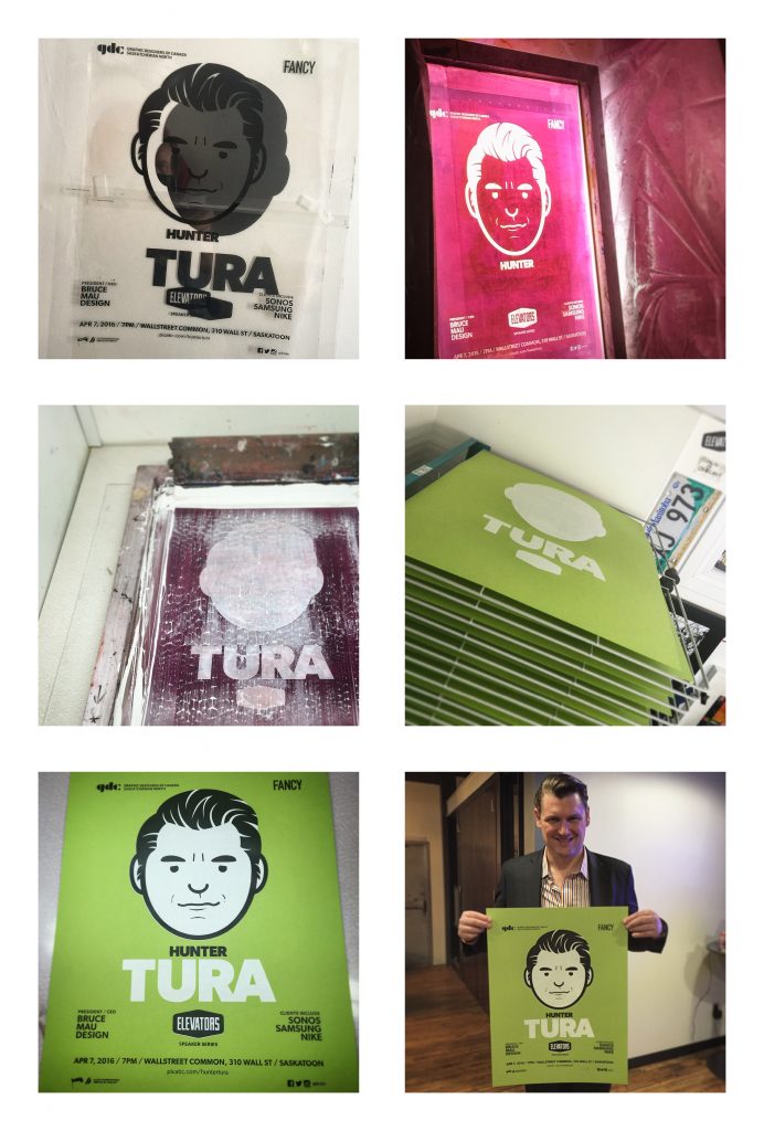
HUNTER TURA POSTER
| Submitted By: | Ryan Schmidt | Sparrowhaus |
|---|---|
| Job Title: | HUNTER TURA POSTER |
| Client: | GDC Saskatchewan North |
| Client Business: | Society of Graphic Designers |
Design / D12 / MISCELLANEOUS
‘Stay in the Game’ – Injury Prevention Awareness Campaign / Mosaic Potash
| Submitted By: | Christian Jensen | Christian Jensen Communications Design |
|---|---|
| Job Title: | ‘Stay in the Game’ - Injury Prevention Awareness Campaign / Mosaic Potash |
| Client: | Mosaic Potash / Capital G Communications |
| Client Business: | Potash Producer |
Objectives:
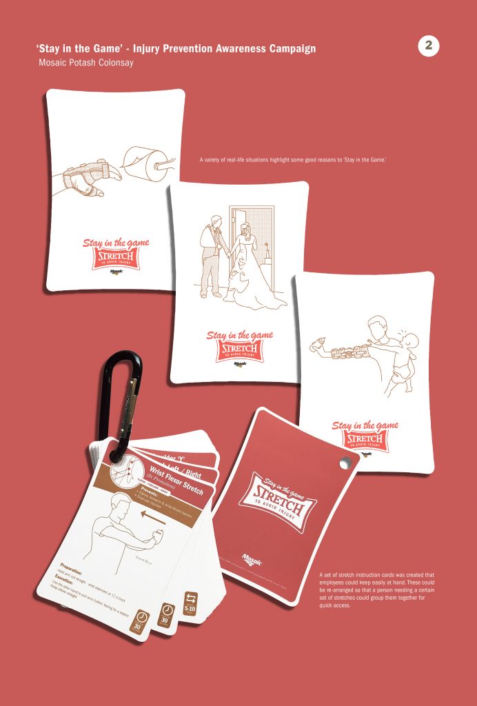
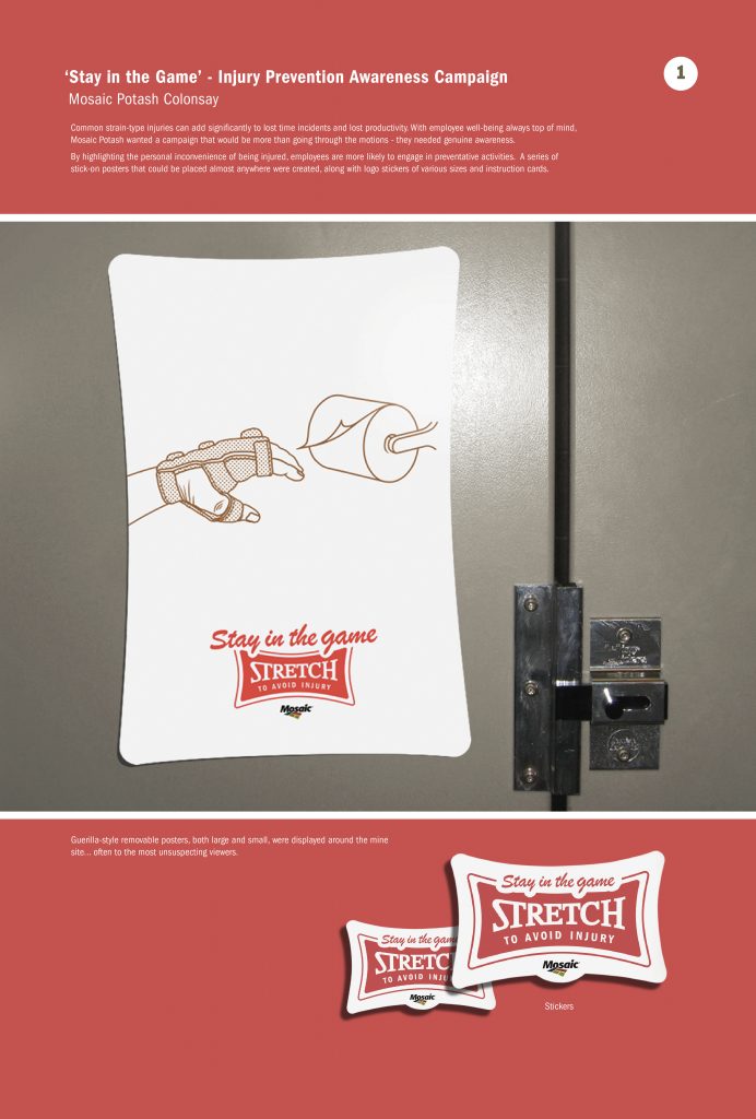
To produce an awareness campaign to bring attention to common strain-type injuries, which can add significantly to lost time incidents and lost productivity. With employee well-being always top of mind, Mosaic Potash wanted a campaign that would be more than going through the motions – they needed genuine awareness.
By highlighting the personal inconvenience of being injured, employees are more likely to engage in preventative activities. A series of stick-on posters that could be placed almost anywhere were created, along with logo stickers of various sizes. A set of stretch instruction cards was also created that employees could keep easily at hand. These cards could be re-arranged on a carabiner clip so that a person needing a certain set of stretches could group them together for quick access.
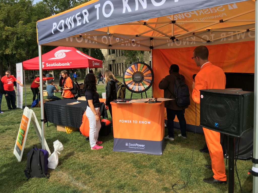
Power To Know
| Submitted By: | Megan Patterson | SaskPower |
|---|---|
| Job Title: | Power To Know |
| Client: | SaskPower |
| Client Business: | Customer Programs - Energy Efficiency |
The experience should focus on power consumption in the form of conservation (behaviors) and efficiency (technology) and how customers can save power, money and the environment.
PROJECT OBJECTIVES AND GOALS
• Have an engaging, interactive and relatable experience customers can participate in that revolves around conservation and efficiency efforts
• In order for a customer to understand the message and then take action, we need to communicate to them in a way that is relatable and easy to understand. They should leave the experience with the knowledge of something they can action to save power, money, etc. (motivators for saving power are different depending on the audience)
• Experience should have a SaskPower look and feel but also include the “You’ve got the power TO SAVE” theme and support Customer Programs Conservation and Efficiency programs and offerings
• Should still be engaging to people not directly participating. (Experience draws attention to itself & is not a ‘individual’ action.)
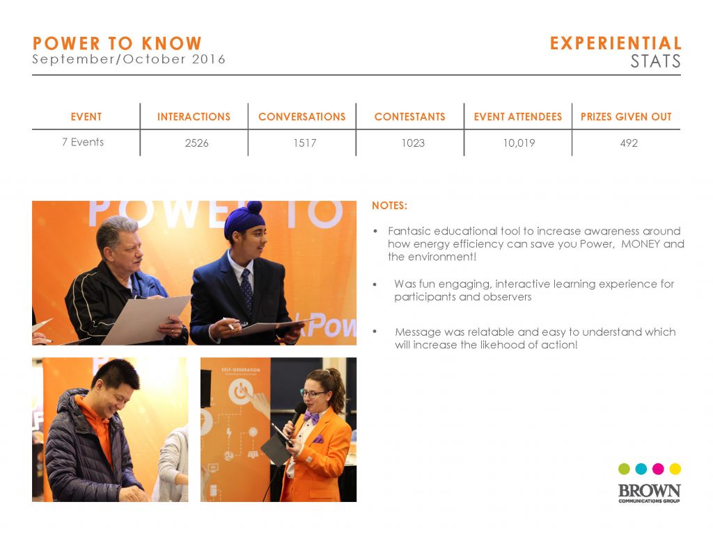
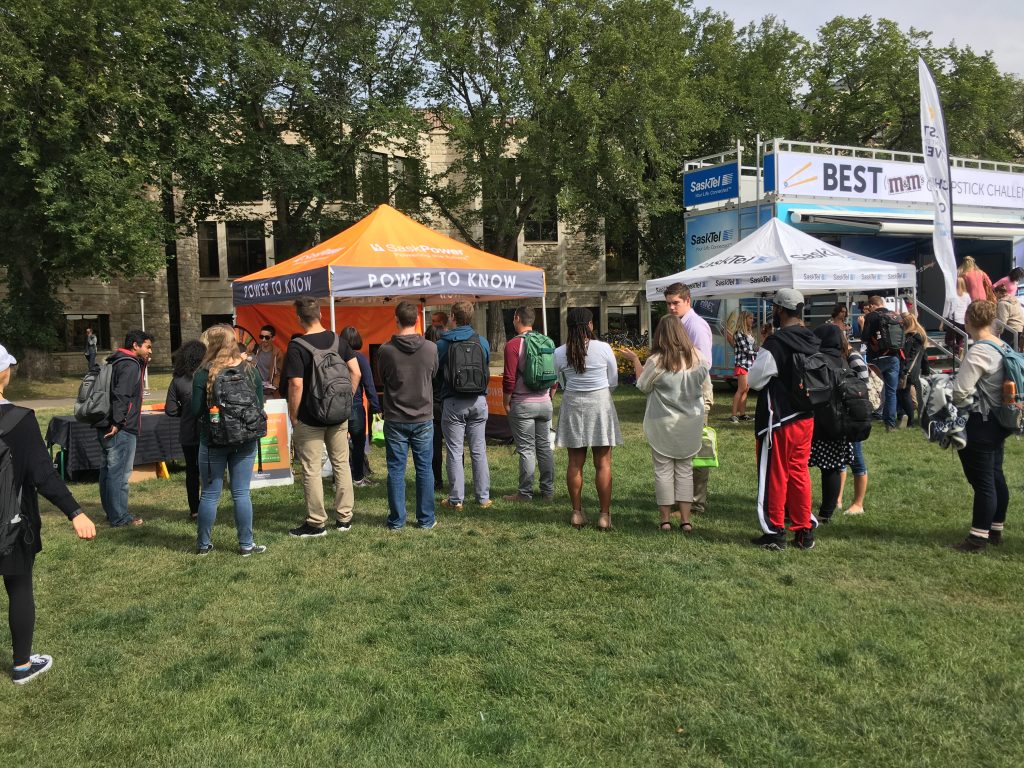
The Power To Know was an interactive game show designed by Brown Communications modeled after the “Price is right” – it included a improv actor who acted as a host and drove the trivia game. The Triva game included energy efficiency questions that were educational for all observing, the game could be played individually or in teams. The Winner had the opportunity to spin the wheel and win an energy efficiency prize! Although we were only able to fun it for 7 events in Sept/Oct 2016 we drove lots over 1517 conversations and over 2500 interactions!
Design / D13 / REJECTS NOT SPECS
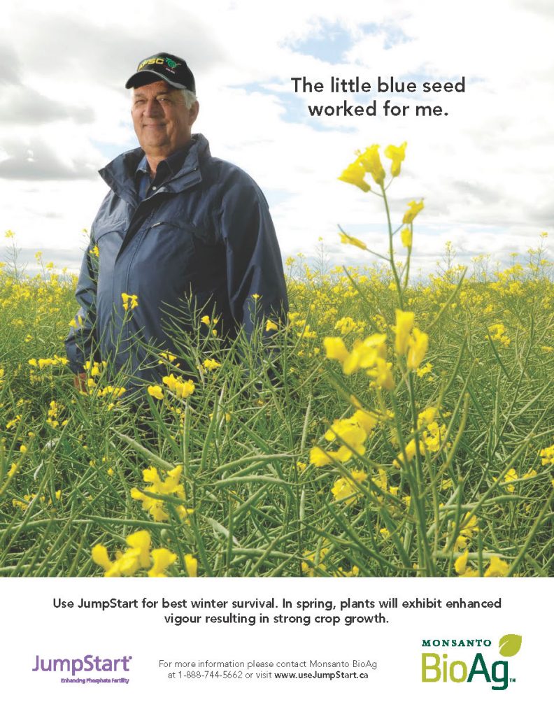
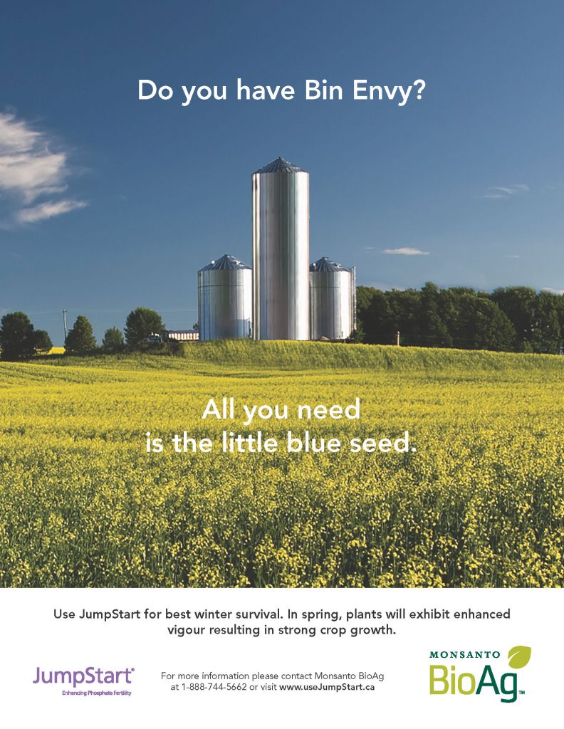
Little Blue Seed
| Submitted By: | | LMNO |
|---|---|
| Job Title: | Jumpstart |
| Client: | Monsanto |
| Client Business: | Agriculture |
Performance in the field is a lot like performance in the bedroom. Wiiiiiiiink.
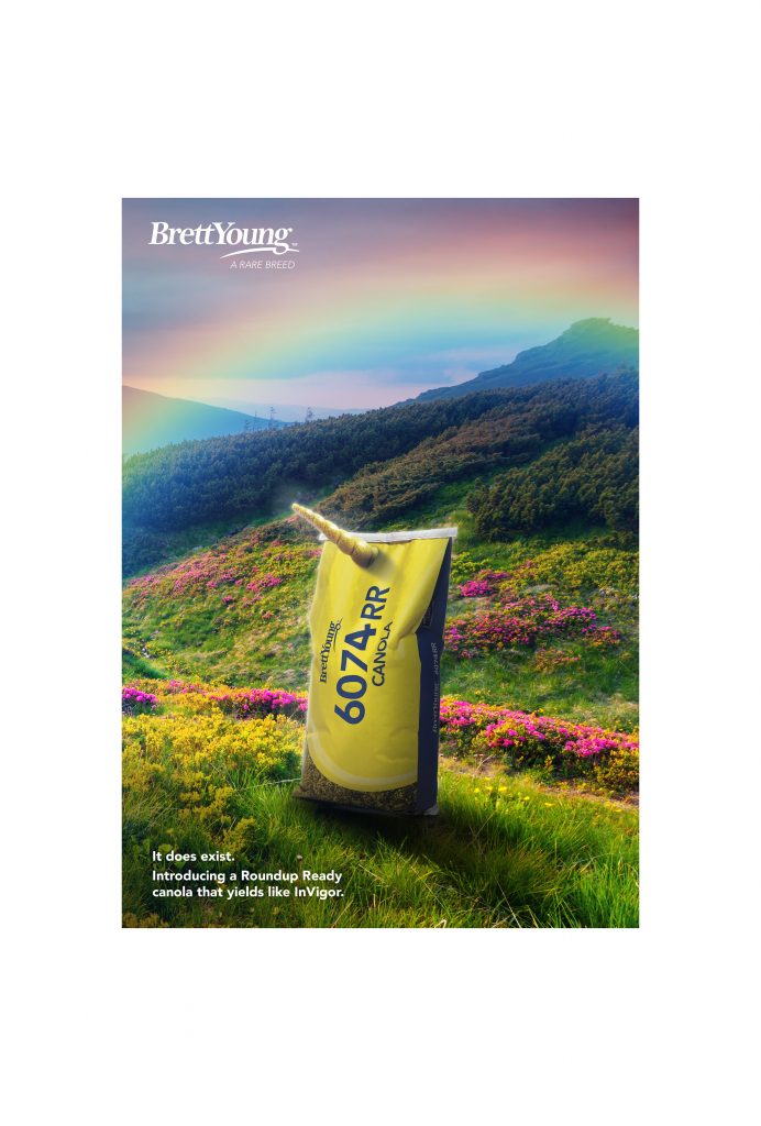
It Does Exist
| Submitted By: | | LMNO |
|---|---|
| Job Title: | Roundup Ready Canola |
| Client: | Brett Young |
| Client Business: | Agriculture |
High yields AND Round-up Ready in one little seed? No, really. It does exist!
Rak’s Plumbing & Heating Logo
| Submitted By: | Cheryl McDougall | OneOliveDesign |
|---|---|
| Job Title: | Rak's Plumbing & Heating Logo |
| Client: | |
| Client Business: |
A new plumber in the field – who loves deer so much he named his business after their antlers – wanted one incorporated into his logo. Too bad he was less adventurous than I and wanted to stick to a more traditional silhouette!
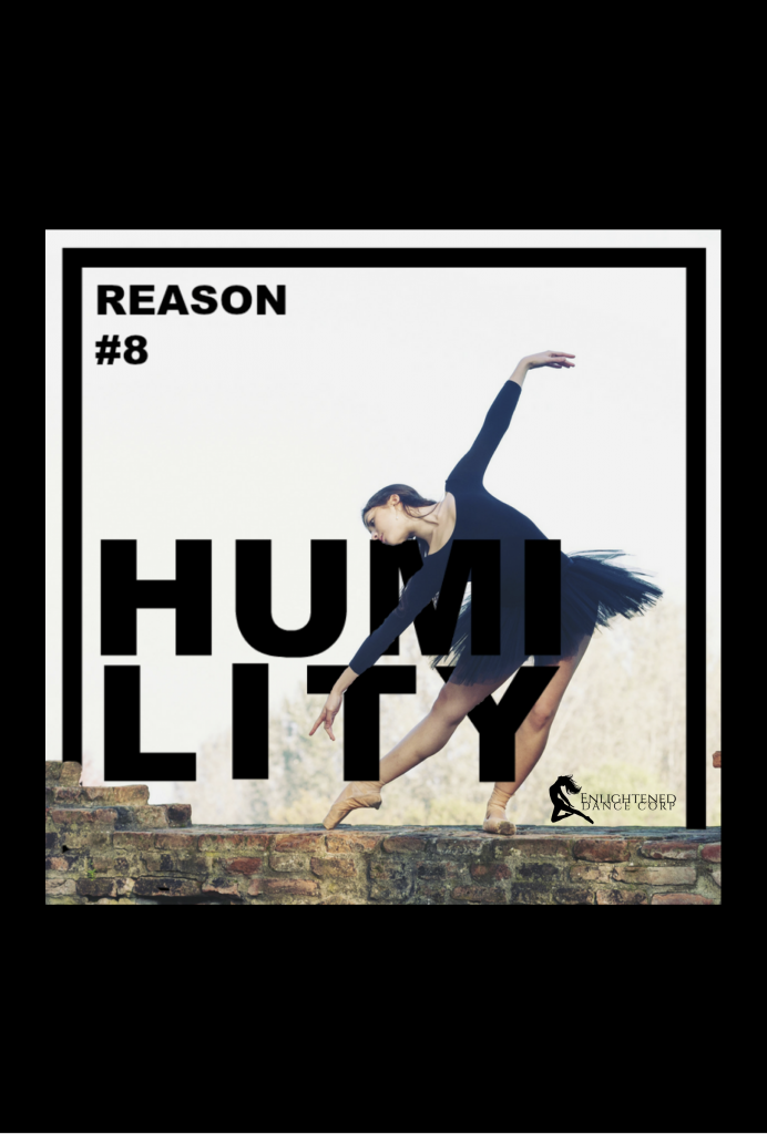
“15 Reasons” Concept
| Submitted By: | Jennifer Bews | The Authentic Voice |
|---|---|
| Job Title: | Graphic & Event Designer |
| Client: | Enlightened Dance Corp |
| Client Business: | Dance Studio |
Create a series of graphics to promote the top 15 benefits for students in dance.
This campaign was intended for the summer months to keep Facebook and Instagram followers engaged with Enlightened Dance Corp.
